Field Control
Immediate
validation simulation tab
How
to specify display type: text area, checkbox, radio etc
How
to set background color and horizontal alignment
See also: Field Grid Layout, Styling Assistants, Introduction to Styling, Controls, Layouts, Using Bootstrap
Description
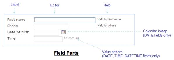
A Field Control provides the ability to display all or part of a field, and consists of the following parts:
- Label – a descriptive text displayed on the left.
- Editor – an input area that displays the field value and receives user input e.g. text box, text area, dropdown list etc – this is displayed to the right of the label.
- Calendar – optionally shown for fields of type DATE (the calendar is not shown when using Bootstrap, use field property Display Type set to Date instead)
- Value Pattern – optionally shown for fields of type DATE, TIME or DATETIME and shows the user the format of data entered or displayed. The value pattern is not shown when using Bootstrap, use field property Display Type set to Date, Time or Datetime-local instead)
- Help – displays a help text for the field.
Any or all of parts can be selectively displayed.
Note that the display type e.g. input box, text area, dropdown etc. is not specified as a property of Field Control; instead it is a property of the underlying Field. To change the display type, click the Field name hyperlink and the Display Type property is found in the Presentation Tab. There are also other display properties that are properties of the underlying field including: display length, and number of rows (for text areas).
Bootstrap
When using Bootstrap, fields are normally displayed vertically like this (this example has no layout set on the parent container):
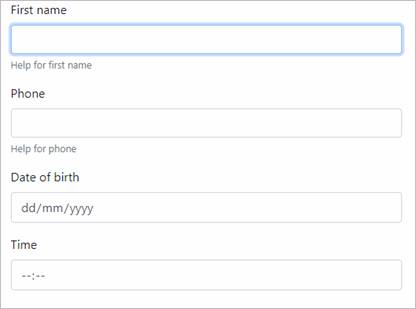
Note that the Calendar and Value Pattern field parts are not shown when using Bootstrap. Instead it is recommended to use the HTML 5 input types Date, Time and Datetime-local; these provide localized input formatting. These input types are specified using field property Display Type.
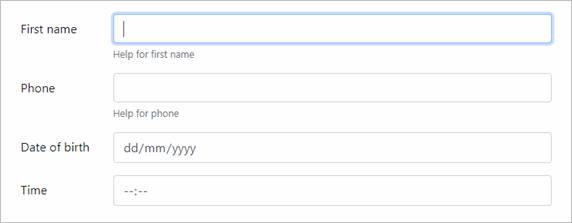
Optionally, fields can be displayed in a grid-like structure with labels and editor portions aligned by using the Bootstrap Field Layout on the parent container:
Non-Bootstrap
When not using Bootstrap, the way the field parts are laid out depends on the layout associated with the Field Control’s parent container.
In particular, a Field Grid Layout is specifically designed to be used with Field Controls and presents the field parts in a columnar display that will align successive fields as shown below: the label, editor and help parts are displayed in table columns that provides vertical alignment with all other Field Controls in the same container; the calendar and value pattern parts are added to the editor part when required.
Other layouts present the field parts with no intervening formatting, and this is not likely to be an appropriate layout unless only a part of the field e.g. the editor part, is displayed.
Properties
See also control common properties and local/inherited control properties.
Style Tab - Styling Assistant
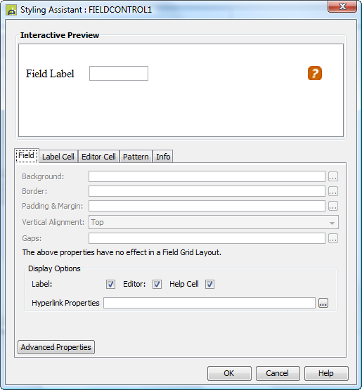
The Styling Assistant shows a sample field in the currently configured layout of the parent container control.
The properties and the Interactive Preview are divided into sections that represent the field parts described above. Each section can be selected from the Edit Properties dropdown or by clicking on the appropriate area in the preview. Note that the Field Properties section is displayed initially, but can only be subsequently redisplayed from the Edit Properties dropdown.
|
Property |
Description |
Name1 |
Type1 |
Get1 |
Set1 |
Get/Set Values1 |
|
Field Properties |
|
|
|
|
|
|
|
The following
properties apply when the field is not
in a Field Grid Layout and are applied to the entire field. |
|
|
|
|
|
|
|
Background |
Background properties for the entire field. See background properties. |
|
|
|
|
|
|
Border |
Border properties for the entire field. See border properties. |
|
|
|
|
|
|
Padding & Margin |
Padding is the space between the field and its border. Margin is the space beyond the border. See padding and margin properties. |
|
|
|
|
|
|
Vertical Alignment |
Vertical alignment for all parts of the field. |
vAlign |
Character |
Yes |
Yes |
Click here for values. |
|
Gaps |
Gaps between the label, editor and help parts of a field. See gap properties. |
|
|
|
|
|
|
The following properties apply in all cases. |
|
|
|
|
|
|
|
Display Options |
|
|
|
|
|
|
|
Label |
Indicates whether the label part of the field should be displayed. |
displayLabelText |
Boolean |
Yes |
Yes |
|
|
Editor |
Indicates whether the editor part of the field should be displayed. |
displayEditor |
Boolean |
Yes |
Yes |
|
|
Help |
Indicates whether the help part of the field should be displayed. |
displayInfoText |
Boolean |
Yes |
Yes |
|
|
Hyperlink Properties |
These properties are applied when the field is displayed as a hyperlink. Hyperlink properties are shown below. |
|
|
|
|
|
|
These properties apply to all hyperlink
states unless overridden by a property for a specific state |
||||||
|
Text |
Hyperlink text properties: font, size, color, bold, italic etc. See text properties. |
hyperlinkProperties .xxx |
|
|
|
|
|
Background |
Hyperlink background properties. See background properties. |
hyperlinkProperties .xxx |
|
|
|
|
|
Border |
Hyperlink border properties. See border properties. |
hyperlinkProperties .xxx |
|
|
|
|
|
Padding & Margin |
Padding is the space between the hyperlink text and its border. Margin is the space beyond the border. See padding and margin properties. |
hyperlinkProperties .xxx |
|
|
|
|
|
These properties apply just to the named
hyperlink state |
||||||
|
Hover |
Override above hyperlink properties for the hover state.
|
hyperlinkProperties .hoverTextStyle .xxx |
|
|
|
|
|
Visited |
Override above hyperlink properties for the visited state.
|
hyperlinkProperties .visitedTextStyle .xxx |
|
|
|
|
|
Linked |
Override above hyperlink properties for the linked state.
|
hyperlinkProperties .linkedTextStyle .xxx |
|
|
|
|
|
Active |
Override above hyperlink properties for the active state.
|
hyperlinkProperties .activeTextStyle .xxx |
|
|
|
|
|
|
|
|
|
|
|
|
|
Style |
CSS class and inline style applied to the <div> tag that wraps all parts of the field. |
fieldClass fieldStyle |
Character |
Yes |
Yes |
As per HTML class parameter As per HTML style parameter |
|
Label Cell
Properties |
The following properties apply to the label part of the field |
|
|
|
|
|
|
Text |
Label text properties: font, size, color, bold, italic etc. See text properties. |
labelProperties .xxx |
|
|
|
|
|
|
|
|
|
|
|
|
|
Style |
CSS class and inline style for the label text. This is applied to the <div> tag that contains the label text. |
labelClass labelStyle |
Character |
Yes |
Yes |
As per HTML class parameter As per HTML style parameter |
|
Label Style |
CSS class and inline style that is applied to the <label> tag that contains the label text. The <label> tag is written inside the <div> tag to which the Style property above is applied. e.g. in most cases, label texts appear as follows: <div><label for=xxxx>label text</label></div> |
labelElementClass labelElementStyle |
Character |
Yes |
Yes |
As per HTML class parameter As per HTML style parameter |
|
The following properties apply to the editor part of the field |
|
|
|
|
|
|
|
Text |
Editor text properties: font, size, color, bold, italic etc. See text properties. |
editorInputProperties .xxx |
|
|
|
|
|
Background |
Editor background properties. See background properties. When in a Field Grid layout, a background can be applied to the containing table cell using parent layout override properties. |
editorInputProperties .xxx |
|
|
|
|
|
|
|
|
|
|
|
|
|
Input Style |
CSS class and inline style for the editor. This corresponds with the <input> tag when the control is not display only. |
editorClass editorStyle |
Character |
Yes |
Yes |
As per HTML class parameter As per HTML style parameter |
|
Style |
CSS class and inline style applied to the <div> tag that wraps the editor. |
editorCellClass editorCellStyle |
Character |
Yes |
Yes |
As per HTML class parameter As per HTML style parameter |
|
Calendar Properties |
The following properties apply to the calendar image. This is only applicable for fields of type DATE where the display calendar option is date/time options has been selected. |
|
|
|
|
|
|
Image |
Properties for the calendar image. See image properties. |
calendarProperties .xxx |
|
|
|
|
|
Pattern Properties |
The following properties apply to the value pattern part of the field. This is only applicable for fields of type DATE, TIME or DATETIME. |
|
|
|
|
|
|
Text |
Value pattern text properties: font, size, color, bold, italic etc. See text properties. |
valuePatternProperties .xxx |
|
|
|
|
|
|
|
|
|
|
|
|
|
CSS class and inline style for the value pattern. |
patternTextClass patternTextStyle |
Character |
Yes |
Yes |
As per HTML class parameter As per HTML style parameter |
|
|
Help Properties |
The following properties apply to the help part of the field |
|
|
|
|
|
|
Text |
Help text properties: font, size, color, bold, italic etc. See text properties. |
infoProperties .xxx |
|
|
|
|
|
Alignment |
Aligns the help text horizontally. This is only applicable when the help text is displayed underneath the field editor i.e. property Help text position is configured as Underneath editor. |
infoProperties .hAlign |
Character |
Yes |
Yes |
Click here for values. Value Fill is not supported. |
|
Popup Properties |
These apply when property help text position is set to as popup window. |
|
|
|
|
|
|
Image |
Properties applied to the help popup image. See image properties. |
infoProperties .imageProperties |
|
|
|
|
|
Popup text |
Properties for the help text in the popup window. See text properties. |
infoProperties .popupTextProperties |
|
|
|
|
|
Popup background |
Popup window background properties. See background properties. |
infoProperties .popupBackgroundProperties |
|
|
|
|
|
Popup padding |
Padding for the help text in the popup window. See padding properties. |
infoProperties popupPaddingProperties |
|
|
|
|
|
Popup window |
Properties that apply to the popup window. See popup window properties. |
infoProperties .popupWindowProperties |
|
|
|
|
|
|
|
|
|
|
|
|
|
Style |
CSS class and inline style for the help text. |
helpClass helpStyle |
Character |
Yes |
Yes |
As per HTML class parameter As per HTML style parameter |
|
Help Window Style |
CSS inline style for the popup window. |
popupHelpStyle |
|
|
|
As per HTML style parameter |
|
Help Window Properties |
These properties are used with the Javascript window.open() statement used to create the popup window. They override any properties configured under Popup window above. |
helpWindowProperties |
|
|
|
|
Html Element Properties Tab
See Html Element Properties Assistant for more information about these properties.
In addition to its Root Element, Html Element Properties can be configured for its Editor, Label and Info. If the Field Control is in a Repeater Control the Id Html Element Property is disabled for every element in the Control.
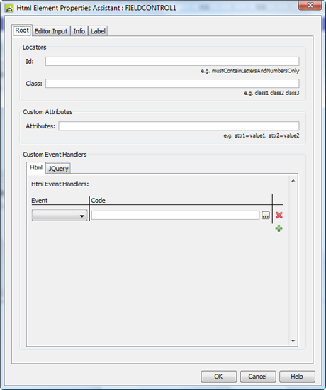
Root Tab
Every Field Control not in a Field Grid Layout is surrounded by a div element; this is its Root element. However Field Controls in a Field Grid Layout are not surrounded by a div but are instead part of a table element. Here the Field Control occupies a row of this table and its tr element is the Root element.
As the Html Element Properties Assistant explains, events Bubble up the DOM, so Event Handlers added to the Root element will respond to events generated in the rest of the Control (because this element surrounds it). For example if an onclick Html Event Handler has been added to the Root element then it will be run whenever a User click in any part of the Control. If an Event Handler is configured for other elements of the Field Control then code in those Event Handlers will run first, followed by the code in the Root Handler.
Editor Input Tab
The Field backing this Field Control can be displayed in a number of ways that affect the underlying element and which HTML Element Properties can be applied:
- Text, Text Areas & Password Display Types: The Editor is an input element and the Html Element Properties are applied directly it.
- Radio Button & Check Box Display
Types: These types cannot have an Id Property (as they are repeating
elements) and the Custom Event Handlers are disabled. The editor is
represented by a series of label
and input element pairs, one for
each button/check box. The Html Element Properties are applied to each of
these input elements.
- Drop Down Display Type: The Editor is a select element and the Html Element Properties are applied directly it.
- Label Display Type: The Editor Tab is disabled – there is no editor for labels.
Info Tab
Html Element Properties are only added to the element when the Help text position Property (see Help Tab below) is set to ‘As Popup Window’. When set to this an image is used which when clicked on a Popup appears containing the help text. This image is represented as an input element with a type="image" attribute and it is to this input element the Html Element Properties are applied to.
Label Tab
The Html Element Properties are applied directly to the label element which represents it. If, however, the Field has a Label Display Type, the label is written out in a <div> tag in which case the Html Element Properties are applied to this div element.
Field Control Tab
|
Property |
Description |
Name1 |
Type1 |
Get1 |
Set1 |
Get/Set Values1 |
|
Field name |
The name of the field displayed by this Field Control; this is displayed as a hyperlink. Click on the link to navigate to the field properties. |
|
Character |
No |
No |
|
|
Place holder |
This text is displayed as an HTML 5 place holder text when the field is editable, has no value and has a display type of text, search, url, tel, email, or password. |
placeHolderText |
Character |
Yes |
Yes |
|
|
Indicates that this is a required field. An asterisk (*) will be shown to the right of the label text. The required field text shown to the user when no value is entered can be specified with the following property. When the document type (see Form Properties Presentation tab) is set to HTML 5 and the browser provides full support for the validation API1, required fields are implemented using the required attribute of the appropriate HTML input tag. This causes the browser to generate messages when no value is specified. These messages will vary between different browsers and are usually displayed in the local language. 1 Browsers that do not fully support the Validation API include all versions of IE |
mandatory |
Boolean |
Yes |
Yes |
|
|
|
Required message text |
Specifies the message displayed to the user when a required field is missing. The default message shown depends on the document type (see Form Properties Presentation tab) :
|
requiredText |
Character |
Yes |
Yes |
|
|
Validation message text |
This text can
be used to override the browser's default validation messages when HTML 5
input validation is used. This applies when any of the HTML 5 field display types are used or when one
of the HTML 5 validation attributes is used e.g. min, max, pattern
etc. It's advisable to be cautious when
overriding the browser's default validation messages. The browser may have
many validation messages for any given type depending on data entered by the
user, whereas it is only possible to enter a single replacement message using
this property. Reasons to override the browser's default might include:
|
validationText |
Character |
Yes |
Yes |
|
|
Indicates that control should pass immediately to the Ebase Server when the user changes the field’s value. This is normally configured together with an on click event that specifies the action to perform. |
immediateValidation |
Boolean |
Yes |
Yes |
|
|
|
Indicates that the field’s value should be displayed as a hyperlink. When the user clicks the link, control is passed to the Ebase Server and the on click event is executed. |
hyperlink |
Boolean |
Yes |
Yes |
|
|
|
Indicates whether the label part of the field should be displayed. |
displayLabelText |
Boolean |
Yes |
Yes |
|
|
|
Indicates whether the editor part of the field should be displayed. |
displayEditor |
Boolean |
Yes |
Yes |
|
|
|
Indicates whether the help part of the field should be displayed. |
displayInfoText |
Boolean |
Yes |
Yes |
|
ARIA tab
The Aria following properties applies to the editor part of the Field Control. If the editor is hidden or not displayed at runtime then the aria properties are ignored.
|
Property |
Name1 |
Description |
Type1 |
Get1 |
Set1 |
Get/Set
Values1 |
|
Aria Label Text |
ariaLabelText |
Provide a text label
for the control e.g button. If specified it will
write out the aria-label attribute. |
Character |
Yes |
Yes |
|
|
Labelled By |
ariaLabelledBy.xxx |
Links the control with a visible text on the screen. This attribute is usually used to give a brief description of the control. For example : ‘Click here for more information’ The value can be either an HTML element id or a text control id. See HTML Element Ids for more information. If specified the aria-labelledby attribute is written. |
|
|
|
|
|
Described By |
ariaDescribedBy.xxx |
Links the control with a visible text on the screen. This attribute is usually used to give a more descriptive meaning to the control. For example ‘Clicking this button will discard all changes you have made to this document’ The value can be either an HTML element id or a text control id. See HTML Element Ids for more information. If specified the aria-describedby attribute The aria-describedby attribute is linked to the help text of the field if this property is not specified and the help text is present and that the help text is not displayed as a popup. |
|
|
|
|
|
Required |
ariaRequired |
Indicates whether to write the aria-required attribute for the control. If the value is set to false, then the attribute is not written. If the required property is set to true then aria-required is implied. This property should be set to true if the browser does not support HTML5 and this is a required field |
Boolean |
Yes |
Yes |
|
Presentation Tab
|
Property |
Description |
Name1 |
Type1 |
Get1 |
Set1 |
Get/Set Values1 |
|
Label for |
Links the label and editor parts of a field when these have been added separately and results in the generation of <label for> HTML with the output of the label part. This property is only enabled when only the label part of a field is displayed alone. |
labelFor |
Character |
Yes |
No |
|
Help Tab
|
Property |
Description |
Name1 |
Type1 |
Get1 |
Set1 |
Get/Set Values1 |
|
Help text position |
Specifies where help text is positioned. Options are:
|
helpPos |
Integer |
Yes |
Yes |
0 - None 1 - To right of editor 2 - Underneath editor 3 - As popup window |
|
Help image |
Specifies the URL of the image displayed when Help text position of popup window is selected. See URL properties for more information. |
helpButImage |
Character |
Yes |
Yes |
See URL properties. |
Button Tab
This tab is only displayed for buttons created before Ebase Version 4.0
|
Property |
Description |
Name1 |
Type1 |
Get1 |
Set1 |
Get/Set Values1 |
|
Button text |
Text for the button. |
buttonText |
Character |
Yes |
Yes |
|
|
Display as image |
Indicates that the image specified in the Image URL property is displayed instead of a button. When displayed as an image, any configured button text is displayed as alternate text. Accessibility note: when using image buttons, an alternate text should always be provided. |
buttonDisplayAsImage |
Boolean |
Yes |
Yes |
|
|
Image URL |
Specifies the URL of the image on the Ebase server when the Display as image property is checked. See URL properties for more information. |
buttonImageUrl |
Character |
Yes |
Yes |
|
|
Skip validation |
Specifies that the system will omit all validation prior to executing the on click event. See skip validation for details. |
buttonSkipValidation |
Boolean |
Yes |
Yes |
|
Events Tab
|
Property |
Description |
Name1 |
Type1 |
Get1 |
Set1 |
Get/Set Values1 |
|
Before Control |
This event is executed each time the system moves forwards to a new page i.e. in the following circumstances:
If the page is subsequently redisplayed by moving forwards (options 2 or 3 above), only events for event fields are executed. Note that this event is not executed when the previous page button is clicked or when a page is re-displayed without a page change e.g. a button click on the same page or display of an error message. See Events for more information. |
|
|
No |
No |
|
|
Validation |
Validation events are intended to be used to validate field values entered by the user. A validation event is executed when:
Validation is unsuccessful if an error message is issued by a script. The page is then returned to the user with the error message, and will be validated again on the next pass (if a non null value still exists). Validation is successful when a validation event is executed and an error message is not issued. The field will not be validated again unless its value changes. Fields are validated in the order they appear in the Outline View, up to the point of an action object clicked by the user e.g. a button, image, hyperlink, immediate validation field etc. Fields past this point are not validated. Page navigation buttons (forwards, backwards etc) are treated as if they are at the bottom of the page, regardless of where they are actually situated i.e. all fields are validated. Tab set selection actions are treated as if they are at the end of the tab set contents i.e. all fields in the currently visible tab are validated before the tab is changed. Validation events are not executed when a button or image with the skip validation option has been clicked. See Events for more information. |
|
|
No |
No |
|
|
On Click |
This event is executed when either:
Any applicable validation events are run before the on click event. If a validation event fails, the on click event is not executed. See Events for more information. |
|
|
No |
No |
|
Immediate validation simulation tab
The following properties apply only for immediate validation fields when Javascript is disabled.
|
Property |
Description |
Name1 |
Type1 |
Get1 |
Set1 |
Get/Set Values1 |
|
Display immediate validation as image |
Indicates that the action button is displayed as an image. If not checked, the action button is displayed as a Go! Button where the button text is taken from system text 399. |
displayIvAsImage |
Boolean |
Yes |
Yes |
|
|
Immediate validation image URL |
When property Display immediate validation as image is selected, this provides the URL of the image used. See URL properties for more information. |
ivImageUrl |
Character |
Yes |
Yes |
|
1 See accessing control properties from scripts
Examples of setting properties via API based language:
controls.FIELDCONTROL2.vAlign
= "Top";
controls.FIELDCONTROL2.mandatory
= true;
controls.FIELDCONTROL2.displayInfoText
= false;
controls.FIELDCONTROL2.labelProperties.textColor
= "white";
Examples of setting properties via FPL:
set FIELDCONTROL2.vAlign = 'Top';
set FIELDCONTROL2.mandatory = 'true';
set FIELDCONTROL2.displayInfoText = 'false';
set FIELDCONTROL2.labelProperties.textColor =
'white';
Hints and Tips
How to specify display type: text area, checkbox, radio etc
The display type e.g. input box, text area, dropdown etc. is not specified as a property of Field Control; instead it is a property of the underlying Field. To change the display type, click the Field name hyperlink and the Display Type property is found in the Presentation Tab.
How to set background color and horizontal alignment
When using a Field Grid Layout, background color and horizontal alignment are usually set using the Field Grid Layout properties and can be specified for individual controls using the parent layout override properties. These properties apply style to the table cell that contains the field (or part of it), and this is usually where background color and alignment are required. The following example illustrates this with the editor part of a Field Control in a Field Grid Layout:

It is also possible to apply background color and alignment to a field part e.g. to the editor using the editor properties, but then the properties are applied directly to the editor and they do something different.

Right Click Menu Actions
Click here for right-click menu actions available to all controls.
Field control right click menu actions:
- Mandatory – acts as a toggle switch for the mandatory property
- Immediate Validation - acts as a toggle switch for the immediate validation property
- Hyperlink - acts as a toggle switch for the hyperlink property
Appearance in Outline View
A Field Control is shown with the field name first followed by the field control name in brackets:

The field control icon has decorator letters attached to it which indicate which parts of the field are displayed:
- L (bottom left) indicates the field label part is displayed. This is controlled by the Display Label property.
- E (top left) indicates the field editor part is displayed. This is controlled by the Display Editor property.
- I (top right) indicates the field help part is displayed. This is controlled by the Display Help property.