Field Grid Layout
Vertical Alignment property appears to do nothing
See also: Containers, Layouts, Introduction to Styling, Styling Assistants, Controls
Description
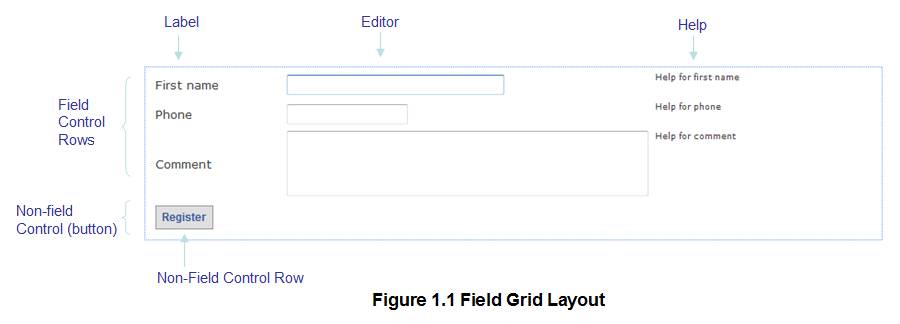
The Field Grid Layout provides specific functionality to display Field Controls in a grid structure where the label, editor and help portions of each Field Control are displayed in three separate table columns and are therefore vertically aligned. To style Field Controls, configure the label, editor and help properties below under Field Control Row.
All other controls are displayed in their own table row with the three table columns merged (see the Register button in the diagram below). To style these non-field controls, configure the Non-Field Control Row properties below.
This layout provides compatibility with the layout used by Ebase Xi prior to Version 4.0.

Controls on same line
When placed inside a container with a Field Grid Layout, all controls have a New Line property which is supported only by the Field Grid Layout. A control is displayed on the same line as the previous control if the New Line property is unchecked. In the case of Field Controls, the label and editor portion of the field are displayed immediately after the editor portion of the previous Field Control and in the same table cell:

For controls other than Field Controls, the control is displayed immediately following its predecessor if the New Line property is unchecked.
Properties
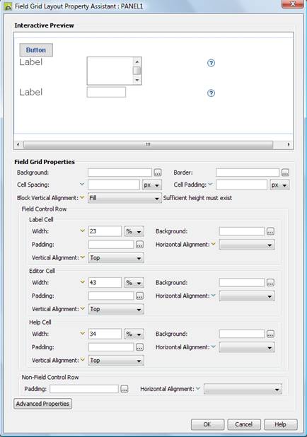
Layout properties are accessed by clicking the Layout properties property of any container control that has a layout type set to Field Grid.

Qualifier: layoutProperties.FIELD
|
Property |
Description |
Name1 |
Type1 |
Get1 |
Set1 |
Get/Set Values1 |
|
This section
contains properties that apply to the entire layout. |
||||||
|
Background applied to the layout table. See background properties. These properties can be overridden for individual controls using the Override layout property. |
|
|
|
|
|
|
|
This border is applied to each row in the layout table. See border properties. |
|
|
|
|
|
|
|
Cell Spacing |
Space between adjacent table cells, including both horizontally, space between label, editor and help cells – and vertically – space between adjacent lines. When this parameter has a non zero value, any borders will be drawn around individual cells. |
cellSpacing |
Character |
Yes |
Yes |
As CSS width property |
|
Cell Padding |
Padding between each table cell’s content and its border. |
cellPadding |
Character |
Yes |
Yes |
As CSS width property |
|
Block Vertical Alignment |
Sets vertical alignment for the entire layout as a whole e.g. setting this property to center will place all controls as a block in the center of the container’s vertical space. This property is only effective when the container is tall enough to accommodate vertical repositioning of its children e.g. the height has been set explicitly using the container’s height property. Options are:
|
vAlign |
Character |
Yes |
Yes |
Click here for values. |
|
Field Control Row |
These properties apply
to a layout row containing a Field Control |
|||||
|
Label Cell
Properties: |
This section
contains properties that apply to the label
part of the layout used with Field Controls. |
|||||
|
Width |
Sets the width of the label table cells. This property is set automatically to a % value when the widths are adjusted using the Field Grid Layout widget. |
labelWidth |
Character |
Yes |
Yes |
As CSS width property |
|
Background applied to each label table cell. See background properties. This group of properties can be overridden for individual controls using the Override layout property. |
labelBackground .xxx |
|
|
|
|
|
|
Padding applied to each label table cell. See padding properties. This group of properties can be overridden for individual controls using the Override layout property. |
labelPadding .xxx |
|
|
|
|
|
|
Sets horizontal alignment for each label within its table cell. This property can be overridden for individual controls using the Override layout property. Options are:
|
labelHAlign |
Character |
Yes |
Yes |
Click here
for values. Value Fill is not
supported. |
|
|
Sets vertical alignment for each label within its table cell. This property can be overridden for individual controls using the Override layout property. Options are:
The default is Top. |
labelVAlign |
Character |
Yes |
Yes |
Click here
for values. Value Fill is not
supported. |
|
|
Editor Cell
Properties: |
This section contains properties that apply to the editor part of the layout used with Field Controls. |
|||||
|
Width |
Sets the width of the editor table cells. This property is set automatically to a % value when the widths are adjusted using the Field Grid Layout widget. |
editorWidth |
Character |
Yes |
Yes |
As CSS width property |
|
Background applied to each editor table cell. See background properties. This group of properties can be overridden for individual controls using the Override layout property. |
editorBackground .xxx |
|
|
|
|
|
|
Padding applied to each editor table cell. See padding properties. This group of properties can be overridden for individual controls using the Override layout property. |
editorPadding .xxx |
|
|
|
|
|
|
Sets horizontal alignment for each editor within its table cell. This property can be overridden for individual controls using the Override layout property. Options are:
|
editorHAlign |
Character |
Yes |
Yes |
Click here
for values. Value Fill is not
supported. |
|
|
Sets vertical alignment for each editor within its table cell. This property can be overridden for individual controls using the Override layout property. Options are:
The default is Top. |
editorVAlign |
Character |
Yes |
Yes |
Click here
for values. Value Fill is not
supported. |
|
|
Help Cell
Properties: |
This section contains properties that apply to the help part of the layout used with Field Controls. |
|||||
|
Width |
Sets the width of the help table cells. This property is set automatically to a % value when the widths are adjusted using the Field Grid Layout widget. |
infoWidth |
Character |
Yes |
Yes |
As CSS width property |
|
Background applied to each help table cell. See background properties. This group of properties can be overridden for individual controls using the Override layout property. |
infoBackground .xxx |
|
|
|
|
|
|
Padding applied to each help table cell. See padding properties. This group of properties can be overridden for individual controls using the Override layout property. |
infoPadding .xxx |
|
|
|
|
|
|
Sets horizontal alignment for each help field part within its table cell. This property can be overridden for individual controls using the Override layout property. Options are:
Warning: when the field help text is displayed underneath the field editor, this property will have no effect. Use the alignment property in Field Control under Help Properties to achieve this. |
infoHAlign |
Character |
Yes |
Yes |
Click here
for values. Value Fill is not
supported. |
|
|
Sets vertical alignment for each help within its table cell. This property can be overridden for individual controls using the Override layout property. Options are:
The default is Top. |
infoVAlign |
Character |
Yes |
Yes |
Click here
for values. Value Fill is not
supported. |
|
|
Non-Field Control
Row: |
This section is used
to style all controls which are displayed across the full width of the layout
(controls other than Field Controls) |
|||||
|
Padding applied to each full width control. See padding properties. This group of properties can be overridden for individual controls using the Override layout property. |
fullWidthPadding .xxx |
|
|
|
|
|
|
Sets horizontal alignment for each full width control within its table cell. This property can be overridden for individual controls using the Override layout property. Options are:
|
fullWidthHAlign |
Character |
Yes |
Yes |
Click here
for values. Value Fill is not
supported. |
|
|
Advanced Properties: |
|
|
|
|
|
|
|
Layout table style |
tableClass tableStyle |
Character |
Yes |
Yes |
As per HTML class parameter As per HTML style parameter |
|
|
See Advanced Properties. This property can be overridden for individual controls using the Override layout property. |
labelCellClass labelCellStyle |
Character |
Yes |
Yes |
As per HTML class parameter As per HTML style parameter |
|
|
See Advanced Properties. This property can be overridden for individual controls using the Override layout property. |
editorCellClass editorCellStyle |
Character |
Yes |
Yes |
As per HTML class parameter As per HTML style parameter |
|
|
See Advanced Properties. This property can be overridden for individual controls using the Override layout property. |
helpCellClass helpCellStyle |
Character |
Yes |
Yes |
As per HTML class parameter As per HTML style parameter |
|
1 See accessing control properties from scripts
Examples of setting properties via API based language:
controls.PANEL1.layout.backgroundColor
= "red";
controls.PANEL1.layout.labelBackground.backgroundColor
= "#00FFFF";
controls.PANEL1.layout.editorPadding.allPadding
= "3px";
controls.PANEL1.layout.tableClass
= "myLayoutTableClass";
controls.PANEL1.layout.labelCellStyle
= "padding-top:5px;";
Examples of setting properties via FPL:
set PANEL1.layoutProperties.FIELD.backgroundColor
= 'red';
set
PANEL1.layoutProperties.FIELD.labelBackground.backgroundColor = '#00FFFF';
set
PANEL1.layoutProperties.FIELD.editorPadding.allPadding = '3px';
set
PANEL1.layoutProperties.FIELD.tableClass = 'myLayoutTableClass';
set
PANEL1.layoutProperties.FIELD.labelCellStyle = 'padding-top:5px;';
Advanced Properties
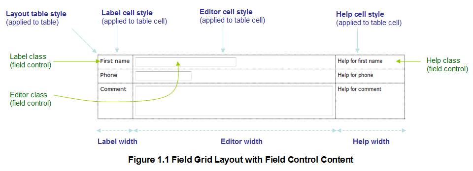
The following diagram shows how Field Controls are laid out in a Field Grid Layout and the available advanced properties. The properties shown in green are Field Control advanced properties as opposed to layout properties and are shown only to provide a complete picture of how Field Controls in a Field Grid Layout are handled. The properties shown in blue are Field Grid Layout advanced properties.

Controls other than field controls are displayed across the full width of the table by spanning all three table columns as shown in the following diagram.

Control Widget
When a Field Grid layout is set on a container control, the grid column width widget is displayed when the container control is selected; this widget allows setting of the label width, editor width and help width properties by dragging the width icons. This widget will set the width properties as % values; to use other size unit values, edit the properties in the dialog above.
![]()
Note that there can be discrepancies between the column widths shown in the widget and the column widths shown immediately below in the WYSIWYG View, click here for further details.
Hints and Tips
Vertical Alignment property appears to do nothing
Use the Vertical Alignment properties for the individual label, editor and help cells. The Vertical Alignment property at the top of the dialog aligns the entire layout as a block and only does anything when the container has sufficient height.
Vertical Alignment
The safest alignment for all the Vertical Alignment properties is Top.
Column Widths not respected
Sometimes, the column widths do not seem to be respected when the form is run in a browser. This is usually because the browser is dynamically changing a width to accommodate some content that doesn’t fit e.g. a large input box. Click here for further details.