Control Common Properties
See also: Designing Accessible Applications
The following properties are common to all controls:
General Properties
|
Property |
Name1 |
Description |
Type1 |
Get1 |
Set1 |
|
Control name |
ctrl |
The control name. All names within a form/component must be unique. |
Character |
Yes |
No |
|
Display only |
displayOnly |
Makes the control and all of its children display only i.e. data cannot be entered. A control is considered to be display only if the control or any of its parents have been set as display only. |
Boolean |
Yes |
Yes |
|
Hidden |
hidden |
Hides the control and all of its children. A control is considered to be hidden if the control or any of its parents have been set as hidden. |
Boolean |
Yes |
Yes |
|
Message options |
|
Provides options to control where messages are displayed and their appearance. See message options for details. |
|
|
|
|
Modifiers |
modifiers |
Modifiers should be entered as a comma delimited list of
individual modifiers e.g. Audit, Supervisor, Mod2 Level1 Modifiers provide a way
of flagging one or more controls so they can be found programatically, e.g. a
group of Field Controls might be changed from enterable to display only. Any
number of modifiers can be assigned - Modifiers are accessed by using method Page.getControlsByModifier(). Javascript example: var page = pages.PAGE_1; for each (var ctrl in page.getControlsByModifier("Audit")) { if (!system.securityManager.hasRole("FINANCE_CONTROLLER")) { ctrl.hide(); }} |
Character |
Yes |
Yes |
|
New Line |
newLine |
When inside a container with Field Grid layout, indicates that the control should be placed on a new line. This property is only shown for controls that support the new line option. See Field Grid Layout for more information. |
Boolean |
Yes |
Yes |
|
Html Element Properties |
|
Provides support for the creation of rich client applications, allows the creation of: locators, event handlers and custom attributes. Click here for more details. |
|
|
|
|
Events |
|
Allows all events for the control to be configured. Displays the events dialog. |
|
No |
No |
1 See accessing control properties from scripts
Style tab
Control Style
Click on the … button to display the Styling Assistant for the control. Details of the properties available with each styling assistant are shown in the documentation for each control – see Controls.
Class
This property is shown for all controls that support a single class property (property cssClass). Enter one or more classes in the text box or click the … button to select from available classes. Please see the documentation for each control for details of how the cssClass property is applied to that control. This class property can also be edited by clicking the … button for the Control Style property, then clicking the Advanced Properties button.
ARIA Properties tab
The following properties are used to enhance web accessibility and are used to provide Alternative Technologies (usually Screen Readers) with semantic information about HTML elements.
See also: Designing Accessible Applications
In general, be
cautious when adding ARIA attributes. The golden rule should be: No ARIA is
better than bad ARIA!
|
Property |
Name1 |
Description |
Type1 |
Get1 |
Set1 |
|
Role |
ariaRole |
Provides an ARIA role for the control that informs assistive technologies – i.e. screen readers - about the purpose of the control and its contents. See ARIA roles. If specified the role attribute is written. The developer can either select a predefined role from the dropdown list or type in their own role. Note that there are automatic mappings between HTML elements and roles and in most cases an explicit role does not need to be defined. One example of where a role might be useful is a Panel Control (which generates a <div> for which there is no automatic mapping) representing a significant part of a page that an un-sighted user might navigate to, then you could add a role of main or region. Note that Field Control does not require a role |
Character |
Yes |
Yes |
|
Label Text |
ariaLabelText |
Provides an ARIA name (or label) for the control e.g a panel or a button. Screen readers will read out the label when a user encounters the control. If specified it will be written out using the aria-label attribute. ARIA labels should be brief descriptions. |
Character |
Yes |
Yes |
|
Labelled By |
ariaLabelledBy.xxx |
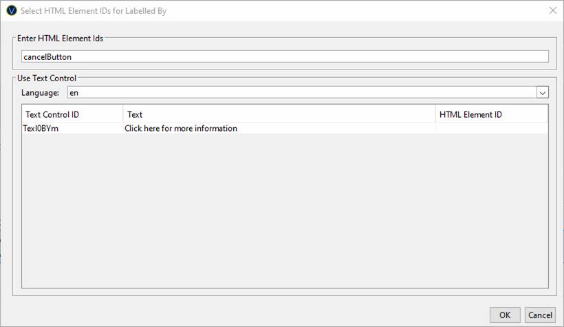
This provides an alternative way of providing an ARIA label (to the Label Text property above) by using another text on the page. Screen readers will read out the label when a user encounters the control. ARIA labels should be brief descriptions. The value can be either an HTML element id or a text control id. See HTML Element Ids for more information. If specified the aria-labelledby attribute is written. |
|
|
|
|
Described By |
ariaDescribedBy.xxx |
Provides an ARIA description for the control e.g a panel or a button. Screen readers will read out the description after the label when a user encounters the control. ARIA descriptions are usually longer than ARIA labels, but they should still be fairly short e.g. ‘Clicking this button will discard all changes you have made to this document’. This property allows you to link the description text to another visible text on the page. The value can be either an HTML element id or a text control id. See HTML Element Ids for more information. If specified the aria-describedby attribute is written. Note that a Field Control automatically writes out the aria-describedby attribute linking to the field help text if specified, and if the help text is not displayed as a popup. |
|
|
|
|
ariaCustomAttributes |
A comma delimited list of name/value pairs of the form: name=value. These are added as attributes to the underlying control |
Character |
Yes |
Yes |
|
API Method |
Description |
Parameters1 |
|
addAriaCustomAttribute |
Adds an aria custom attribute to the aria attributes property. If the attribute already exists the value will be overridden with the new value. |
name – name of the attribute to add value – value of the attribute |
|
removeAriaCustomAttribute |
Removes an aria custom attribute from the aria attributes property if the attribute exists. |
name – name of the attribute to remove |
ARIA HTML Element Ids
Aria HTML Element IDs can be configured by either typing in the HTML element id of an HTML element on the page:

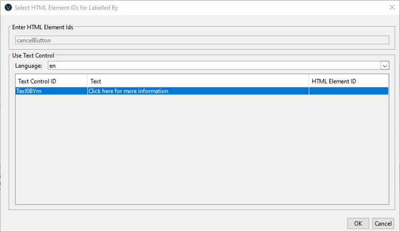
Alternatively by selecting a Text Control from the list:

Selecting a Text Control overrides the HTML Element Id and this will be will be used to link the control to the relevant information text.
|
Property |
Name1 |
Description |
Type1 |
Get1 |
Set1 |
|
HTML Element Ids |
HTMLElementIds |
Links the control with an HTML element id within the HTML document. |
Character |
Yes |
Yes |
|
Text Control |
textControl |
Overrides the HTML element id property specified above and links the attribute to the Text Control on the page. Runtime functionality: an HTML element id is generated automatically if a Text Control is selected for which no HTML Element Locator Id is configured. |
Character |
Yes |
Yes |