Layouts
Overriding
Layout Properties Locally
See also: Introduction to Styling, Containers, Styling Assistants, Controls
Introduction
A layout defines how child controls of a container control are laid out relative to each other. Each container control has a Layout type property which defines which layout is applied. Once a layout type is set, the Layout properties property can be used to access the layout’s Styling Assistant to further configure the layout e.g. to set horizontal and vertical alignment, gaps between controls etc. The available layouts are:
- No Layout – this is the default for new container controls. The HTML/XHTML to render each control is written to the browser. Normally this will result in adjacent controls appearing horizontally, but the browser may decide to place any control on a new line if insufficient width is available.
- Bootstrap Field Layout – this layout is only enabled when using bootstrap and provides a responsive grid layout where field labels and editors are aligned
- Flow Layout – similar to No Layout but provides some additional layout properties – vertical alignment and gaps between controls. Also, new block elements within a Flow Layout will be rendered as inline blocks and will not begin on a new line.
- Vertical Box Layout – lays out child controls vertically by placing each child control on a new line.
- Horizontal Box Layout – lays out child controls horizontally.
- Field Grid Layout – a special layout to provide alignment for input fields and labels.
- List Layout – the container is rendered as an unordered or ordered list and each child control is rendered inside a list item
- Column Layout - child controls are laid out in a grid formation where each child control is placed in the next available table cell. The number of table columns can be configured.
- Custom Layout – the HTML used to layout child controls is configurable.
Layout Properties
When the Layout type property for a container has been set, clicking on the Layout properties property gives access to the Styling Assistant for that layout. Click on the links above to see the layout properties for each layout type.
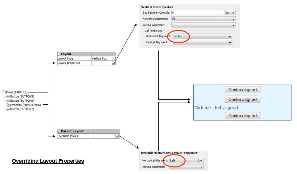
Overriding Layout Properties Locally
In general, layout properties are properties of the container and are applied by the container. However, in some cases, these properties can be overridden by individual child controls. This is done by clicking the Override layout property for a child control – this appears in the Parent Layout section of the child control’s properties. In the following example, a Panel Control’s center horizontal alignment is overridden to left for a hyperlink.

Liquid Layouts using % widths
When not using bootstrap styling, click here for an example of using a liquid layout where widths are specified as percentages based on the current width of the browser window and the page content expands to fill the available width. A liquid layout will adjust itself dynamically as the width of the browser adjusts e.g. when the orientation of a tablet or mobile phone is changed.