Repeater Control
Changing
child controls dynamically
Dynamic
changes with nested Repeater Controls
See also: Containers, Introduction to Styling, Styling Assistants, Controls, Layouts, Table Control
Repeater Control
Description
A Repeater Control provides a flexible way of displaying data from a table. Each row of the table is displayed inside a Repeater Row Control and this can have any layout and can include any other control as a child. A Repeater Row Control is added automatically when a Repeater Control is added to a page.
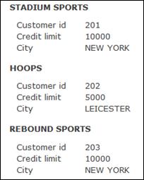
When the HTML output for a page is generated, the system iterates through the table rows and displays the contents of the Repeater Row Control for each table row. The simple example below shows each table row displayed across multiple lines.

Repeater Controls have the same scrolling abilities as a Table Control. The number of rows displayed in each scroll set can be configured, the scroll bar can be displayed at the top, bottom or both, and many other scrolling options. See Navigation Bar properties below.
There are two layouts to be considered when using a Repeater Control. The first layout is associated with the Repeater Control itself and determines how each successive row of the table is laid out. The second layout is associated with the Repeater Row Control and determines how the content of each row is laid out. For example, in the illlustration above, the Repeater Control has a Vertical Box Layout and the Repeater Row Control has a Field Grid Layout. Changing the Repeater Control to use a Column Layout with 3 columns displays the same data like this:

And changing the Repeater Control to use a Vertical Box Layout and the Repeater Row Control to use a Horizontal Box Layout displays the same data like this:

Navigation Bar
See also navigation bar and vertical scrolling. To disable the navigation bar and display all rows, change the No. Visible Rows property to 0.

Navigation Bar features:
· The navigation bar can be omitted, displayed above the Repeater Control, displayed below the Repeater Control, or displayed both above and below the Repeater Control
·
The navigation bar can be aligned centrally,
left or right
· Vertical scrolling can be displayed as icons or as texts as shown above (chevrons). Texts are used when no image URL has been specified for a vertical scroll icon property. When texts are used, they are taken from System texts 381 – 384.
· The scroll to top and scroll to bottom icons/texts are optional.
· The display of clickable page numbers is optional and the number of page number links displayed can be configured.
· Scroll icons/texts and page numbers are considered active when they can be clicked and inactive when they can’t be clicked e.g. a scroll up icon would be inactive when the first page is displayed. The display of inactive icons/texts can optionally be suppressed.
Properties
See also control common properties and local/inherited control properties.
Runtime
only properties
|
Property |
Description |
Name1 |
Type1 |
Get1 |
Set1 |
|
Visible row |
When read, this property returns the internal row number of the
first row currently visible to the user i.e. the first row in the current
scroll set. Returns -1 when the table is empty. When set with an internal row number, the table row is made visible
i.e. the system will scroll the table to make the row visible. Invalid row
numbers are ignored. |
visibleRow |
Integer |
Yes |
Yes |
|
First Display Row |
This read only property returns the internal row number of the first
display row – equivalent to scroll to top. This can be used in conjunction
with the visibleRow
property above to programmatically scroll to the top e.g. set repeater1.visibleRow = repeater1.firstDisplayRow; Returns -1 when the table is empty. |
firstDisplayRow |
Integer |
Yes |
No |
Style Tab – Styling Assistant
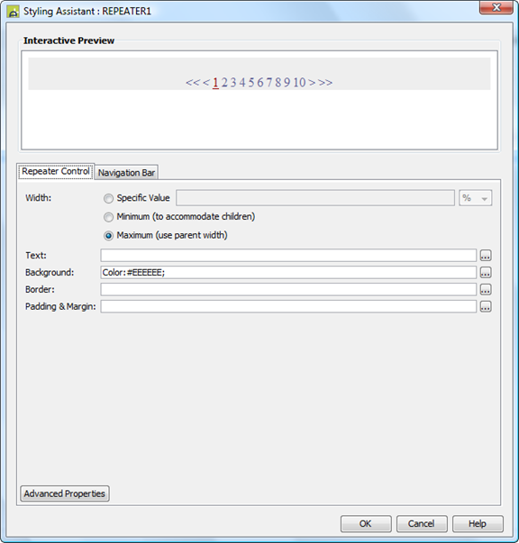
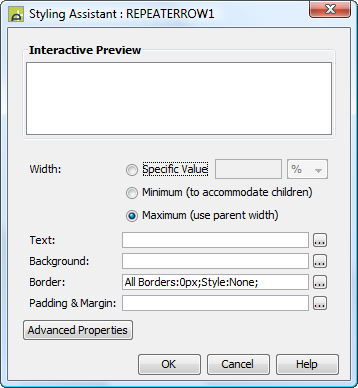
The properties and the Interactive Preview are divided into sections that represent different parts of a Repeater Control. Each section can be selected from the Edit Properties dropdown or by clicking on the appropriate area in the preview. The sections are:
- Repeater Control – properties for the entire control
- Navigation Bar – properties for the navigation bar both at the top and/or the bottom

|
Property |
Description |
Name1 |
Type1 |
Get1 |
Set1 |
Get/Set
Values1 |
|
The following properties apply to the entire Repeater Control |
|
|
|
|
|
|
|
Width |
Sets the width to one of the following: · A specific value e.g. 300px · The minimum value: this results in the Repeater Control being just as wide as it needs to be to accommodate its content. · The maximum value: the width is taken from the parent container control. This width will then include the Repeater Control plus any configured padding, border or margins. Note that this setting will be ignored if the parent container layout specifies a horizontal cell alignment of fill (this applies to Horizontal Box, Vertical Box and Column layouts). This is equivalent to specifying maximum above. Warning: when a specific value is set, any padding, border or margins will be in addition to the specified value and can cause the Repeater Control to “break out” of its parent space. In particular, try and avoid specifying a width of 100%; use maximum instead. See also: understanding width. The default is maximum. |
width |
Character |
Yes |
Yes |
As per CSS width property null: equivalent to maximum Child: equivalent to minimum |
|
Text |
Sets default text properties for the entire control: font, size, color, bold, italic etc. See text properties. |
|
|
|
|
|
|
Background |
Background properties for the entire control. See background properties. |
|
|
|
|
|
|
Border |
Border properties for the entire control. See border properties. |
|
|
|
|
|
|
Padding and Margin |
Padding is the space inside the border. Margin is the space beyond the border. See padding and margin properties. |
|
|
|
|
|
|
|
|
|
|
|
|
|
|
Style |
CSS class and inline style applied to the containing HTML <div> tag. All child content is written inside this <div>. |
cssClass style |
Character |
Yes |
Yes |
As per HTML class parameter As per HTML style parameter |
|
The following properties apply to the Navigation Bar |
|
|
|
|
|
|
|
Text |
Sets default text properties for the navigation bar: font, size, color, bold, italic etc. See text properties. |
navigationStyleProperties .xxx |
|
|
|
|
|
Background |
Navigation bar background properties. See background properties. |
navigationStyleProperties .xxx |
|
|
|
|
|
Position |
Controls positioning of the navigation bar. This can be at the top of the Repeater Control (above), at the bottom of the Repeater Control (below), both of these, or none (navigation bar is not displayed). |
navigationDisplay |
Character |
Yes |
Yes |
T (above) U (below) B (both) null (none) |
|
Icons |
Shows a dialog to configure image locations of all horizontal and vertical scrolling icons with the properties shown below. |
|
|
|
|
|
|
Active
icons: |
|
|
|
|
|
|
|
Scroll to top icon |
|
scrollToTopIcon |
Character |
Yes |
Yes |
See URL properties. |
|
Scroll to bottom icon |
|
scrollToBottomIcon |
Character |
Yes |
Yes |
See URL properties. |
|
Scroll up icon |
|
scrollUpIcon |
Character |
Yes |
Yes |
See URL properties. |
|
Scroll down icon |
|
scrollDownIcon |
Character |
Yes |
Yes |
See URL properties. |
|
Inactive icons: |
|
|
|
|
|
|
|
Scroll to top icon |
|
inactiveScrollToTopIcon |
Character |
Yes |
Yes |
See URL properties. |
|
Scroll to bottom icon |
|
inactiveScrollToBottomIcon |
Character |
Yes |
Yes |
See URL properties. |
|
Scroll up icon |
|
inactiveScrollUpIcon |
Character |
Yes |
Yes |
See URL properties. |
|
Scroll down icon |
|
inactiveScrollDownIcon |
Character |
Yes |
Yes |
See URL properties. |
|
Horizontal Scrolling Icons: |
|
|
|
|
|
|
|
Scroll left icon |
|
scrollLeftIcon |
Character |
Yes |
Yes |
See URL properties. |
|
Scroll right icon |
|
scrollRightIcon |
Character |
Yes |
Yes |
See URL properties. |
|
Top Align |
The alignment of the navigation when the bar is displayed at the top. |
navigationAlignTop |
Character |
Yes |
Yes |
L
(left) R
(right) C
(center) |
|
Bottom Align |
The alignment of the navigation bar when the bar is displayed at the bottom. |
navigationAlignBottom |
Character |
Yes |
Yes |
L
(left) R
(right) C (center) |
|
Border |
Navigation bar border properties. See border properties. |
navigationStyleProperties .xxx |
|
|
|
|
|
Padding |
Padding is the space between the navigation bar and its border. See padding and margin properties. |
navigationStyleProperties .xxx |
|
|
|
|
|
Additional Information Texts: |
The following properties apply to the optional navigation bar prefix text and the number of rows information text. See above. |
|||||
|
Display navigation bar prefix text |
Indicates whether or not the navigation bar prefix text is displayed (Go to Page: in the example above). This text is taken from System text 380. This text is styled using the Row information style property. |
displayInfoPrefix |
Boolean |
Yes |
Yes |
|
|
Display no. rows information text |
Indicates whether or not the row information text is displayed. This text shows the number of records. The default text Displaying …. of … records is built using system texts 370, 371, 372, 373 |
showInfoMessage |
Boolean |
Yes |
Yes |
|
|
Nav bar prefix text |
Navigation bar prefix text properties: font, size, color, bold, italic etc. See text properties. |
rowPrefixProperties .xxx |
|
|
|
|
|
No. rows info text |
Row information text properties: font, size, color, bold, italic etc. See text properties. |
rowInformationProperties .xxx |
|
|
|
|
|
Page Numbers: |
|
|
|
|
|
|
|
Display |
Activates the display of clickable page numbers |
showPageNumbers |
Boolean |
Yes |
Yes |
|
|
Number of Pages |
The number of page numbers shown when the previous property Display has been selected. |
maxNumberOfResultPages |
Integer |
Yes |
Yes |
|
|
Page No. Text |
Text properties for inactive page numbers i.e. pages other than the currently displayed page: font, size, color, bold, italic etc. See text properties. |
inactivePageNumberProperties .xxx |
|
|
|
|
|
Current Page Text |
Text properties for the currently displayed page: font, size, color, bold, italic etc. See text properties. |
activePageNumberProperties .xxx |
|
|
|
|
|
Gap |
The space between page numbers and scrolling icons/texts in the navigation bar. |
navigationStyleProperties .spacerSize |
|
|
|
As per CSS width property. |
|
Page Navigation: |
|
|
|
|
|
|
|
Display scroll to top/bottom |
Activates the display of the scroll to top and scroll to bottom icons or corresponding texts. |
displayTopBottomIcons |
Boolean |
Yes |
Yes |
|
|
Display inactive scrolling |
Determines whether inactive scroll icons/texts are displayed. For example when this property is checked, scroll up and scroll to top icons/texts are displayed when the first page of a scroll set is displayed. |
showInactiveScrollIcons |
Boolean |
Yes |
Yes |
|
|
Navigation Text |
Text properties for active icons/texts: font, size, color, bold, italic etc. See text properties. |
pageNavigationProperties .xxx |
|
|
|
|
|
Inactive Navigation Text |
Text properties for inactive vertical scroll icons/texts: font, size, color, bold, italic etc. See text properties. |
inactivePageNavigationProperties .xxx |
|
|
|
|
|
|
|
|
|
|
|
|
|
Navigation bar style |
CSS class and inline style applied to the <div> tag containing the entire navigation bar. |
navigationBarClass navigationBarStyle |
Character |
Yes |
Yes |
As per HTML class parameter As per HTML style parameter |
|
Navigation bar prefix style |
CSS class and inline style applied to the navigation bar prefix text. |
infoPrefixClass infoPrefixStyle |
Character |
Yes |
Yes |
As per HTML class parameter As per HTML style parameter |
|
Row information style |
CSS class and inline style applied to the number of records row information text. |
rowInformationClass rowInformationStyle |
Character |
Yes |
Yes |
As per HTML class parameter As per HTML style parameter |
|
Active vertical scroll icon style |
CSS class and inline style applied to active vertical scroll icons/texts. |
navigationClass navigationStyle |
Character |
Yes |
Yes |
As per HTML class parameter As per HTML style parameter |
|
Inactive vertical scroll icon style |
CSS class and inline style applied to inactive vertical scroll icons/texts. |
inactiveNavigationClass inactiveNavigationStyle |
Character |
Yes |
Yes |
As per HTML class parameter As per HTML style parameter |
|
Active page numbers style |
CSS class and inline style applied to active page numbers – pages other than the current page. This can be modified if required to provide separate style for active and hover links by adding the appropriate pseudo-class selector rule to the stylesheet e.g. a.myclass:hover. |
pageNumbersClass pageNumbersStyle |
Character |
Yes |
Yes |
As per HTML class parameter As per HTML style parameter |
|
Current page number style |
CSS class and inline style applied to inactive pages i.e. the current page number. This can be modified if required to provide separate style for active and hover links by adding the appropriate pseudo-class selector to the stylesheet e.g. a.myclass:hover. |
currentPageClass currentPageStyle |
Character |
Yes |
Yes |
As per HTML class parameter As per HTML style parameter |
|
Horizontal scroll icon style |
CSS class and inline style applied to the horizontal scroll icons. |
tablePageScrollClass tablePageScrollStyle |
Character |
Yes |
Yes |
As per HTML class parameter As per HTML style parameter |
Html Element Properties Tab
This allows you to add element properties to the root element of the Control – see Html Element Properties for more information.
Layout Tab
|
Property |
Description |
Name1 |
Type1 |
Get1 |
Set1 |
Get/Set Values1 |
|
Layout type |
Defines the layout used to lay out all child controls |
layout |
Character |
Yes |
No |
|
Additional layout properties depend on the selected layout (property Layout type)
Repeater Control Tab
|
Property |
Description |
Name1 |
Type1 |
Get1 |
Set1 |
Get/Set Values1 |
|
Table name |
The name of the table associated with this Repeater Control; this is displayed as a hyperlink. Click on the link to navigate to the table properties. |
|
Character |
No |
No |
|
|
No. visible rows |
Indicates the number of table rows presented to the user. When more rows exist in the table, a vertical scrolling bar is displayed. Set this to a value of 0 or remove the value to indicate that all rows should be displayed without scrolling. |
numVisibleRows |
Integer |
Yes |
Yes |
|
|
An FPL conditional expressional that limits which table rows are displayed. The expression is applied to each row in the underlying table when the page is prepared for output. The expression can refer to any form field or table column and must evaluate to true or false. Click the .. button to edit the filter expression in an expanded panel. This might be used to implement nested tables, to hide certain rows etc e.g. · ORDERS-CUSTOMER_ID = CUSTOMER-CUSTOMER_ID · TAB1-SECURE_ROW != 'Y' · TAB1-TRANS_LIMIT > STANDARD_LIMIT Click here for more information on how filter expressions are used to implement nested tables. |
filterExpression |
Character |
Yes |
Yes |
|
PDF Tab
|
Property |
Description |
Name1 |
Type1 |
Get1 |
Set1 |
Get/Set Values1 |
|
Page break only on new row |
When a page is printed to a PDF, this ensures that the content of each repeating row will not be split across two pages i.e. if the content of any given repeating row does not fit on the current page, a page break is inserted before writing the row. See Designing Print Pages. |
startNewRowOnNextPage |
Boolean |
Yes |
Yes |
|
1 See Accessing control properties from scripts
Right Click Menu Actions
Click here for right-click menu actions available to all controls.
There are no specific right click actions for this control.
Appearance in Outline View
A Repeater Control is shown with the control name in brackets:

Repeater Row Control
Description
A Repeater Row Control represents a single table row within a Repeater Control. It is a system control and cannot be inserted or deleted manually; there is a one-to-one relationship between a Repeater Control and a Repeating Row Control.
Each Repeater Row Control acts as a container for any content added to it. Typically this will be controls to display/edit data from the table associated with the Repeater Control, but any other controls can also be added.
Properties
See also control common properties and local/inherited control properties.
Style Tab – Styling Assistant

|
Property |
Description |
Name1 |
Type1 |
Get1 |
Set1 |
Get/Set Values1 |
|
Width |
Sets the width to one of the following: · A specific value e.g. 300px · The minimum value: this results in the Repeater Row Control being just as wide as it needs to be to accommodate its children. · The maximum value: the width is taken from the parent Repeater Control. This width will then include the Repeater Row Control plus any configured padding, border or margins. Note that this setting will be ignored if the parent container layout specifies a horizontal cell alignment of fill (this applies to Horizontal Box, Vertical Box and Column layouts). This is equivalent to specifying maximum above. Warning: when a specific value is set, any padding, border or margins will be in addition to the specified value and can cause the Repeater Row Control to “break out” of its parent space. In particular, try and avoid specifying a width of 100%; use maximum instead. See also: understanding width. The default is maximum. |
width |
Character |
Yes |
Yes |
As per CSS width property null: equivalent to maximum Child: equivalent to minimum |
|
Text |
Sets the text properties for any child controls: font, size, color, bold, italic etc. See text properties. |
|
|
|
|
|
|
Background |
See background properties. |
|
|
|
|
|
|
Border |
See border properties. |
|
|
|
|
|
|
Padding and Margin |
Padding is the space inside the border. Margin is the space beyond the border. See padding and margin properties. |
|
|
|
|
|
|
|
|
|
|
|
|
|
|
Style |
This CSS class and style is applied to the <div> tag. One <div> tag is written for each table row and will contain all child controls. |
cssClass style |
Character |
Yes |
Yes |
As per HTML class parameter As per HTML style parameter |
Html Element Properties Tab
This allows you to add element properties to the root element of the Control – see Html Element Properties for more information.
Layout tab
|
Property |
Description |
Name1 |
Type1 |
Get1 |
Set1 |
Get/Set Values1 |
|
Layout type |
Defines the layout used to lay out all child controls |
layout |
Character |
Yes |
No |
|
Additional layout properties depend on the selected layout (property Layout type)
1 See accessing control properties from scripts
Right Click Menu Actions
Click here for control common right-click menu actions.
There are no specific right click actions for this control.
Appearance in Outline View
A Repeater Row Control is shown with the control name in brackets:

Changing child
controls dynamically
Controls that are children of a Repeater Row Control can be changed by looping through the table associated with the Repeater Control. The system automatically associates each table row with the corresponding controls that will be displayed. For example if the following Repeater Control is associated with the ACCOUNTS table:

This script code could then be
used to flag overdrawn accounts with a red background.
|
FPL: |
API based language (Javascript): |
|
loop at ACCOUNTS if [ACCOUNTS-OVERDRAWN = 'Y'] set ACCOUNTS_PANEL.backgroundColor
= 'red'; endif endloop |
var accountsTab = tables.ACCOUNTS; var rows = accountsTab.rows; while (rows.next()) { if (accountsTab.OVERDRAWN.value) { controls.ACCOUNTS_PANEL.backgroundColor="red"; } } |
Dynamic changes with nested Repeater Controls
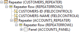
In the example above, looping through the ACCOUNTS table sets the current row for that table and this is all that is required. When there are nested Repeater Controls, it is also necessary to set the current row for all parent tables. In the example below, the ACCOUNTS Repeater is nested inside a CUSTOMERS Repeater.

The script code needs to set the current row of the parent CUSTOMERS table as it loops through the ACCOUNTS table. In this case, the tables are joined via the CUSTOMER_ID column of ACCOUNTS.
|
FPL: |
API based language (Javascript): |
|
loop at ACCOUNTS if [ACCOUNTS-OVERDRAWN = 'Y'] // set the current row for the parent CUSTOMERS
table char x = settablerow('CUSTOMERS',
'CUSTOMERS-CUSTOMER_ID', ACCOUNTS-CUSTOMER_ID); set ACCOUNTS_PANEL.backgroundColor
= 'red'; endif endloop |
var accountsTab = tables.ACCOUNTS; var custTab = tables.CUSTOMERS; var rows = accountsTab.rows; while (rows.next()) // this sets the current row for the
ACCOUNTS table { if (accountsTab.OVERDRAWN.value) { // set the current row for
the parent CUSTOMERS table var
parentRow = custTab.findRow(custTab.CUSTOMER_ID, accountsTab.CUSTOMER_ID.value); custTab.setCurrentRow(parentRow); controls.ACCOUNTS_PANEL.backgroundColor="red"; } } |