Grid Control
Control overflows to the right
See also: Styling Assistants, Introduction to Styling, Controls, Layouts
This page contains documentation on Grid Control which represents a grid, and Grid Cell Control which represents an individual grid cell.
Grid Control
Description
A Grid Control represents a grid consisting of any number of rows and columns. Each grid cell contains a single Grid Cell Control which acts as a container for any content added to the cell; a Grid Cell Control is a system control which cannot be added from the palette.
The following diagram shows a selected empty Grid Control with the initial default of three rows and three columns:

A Grid Control provides the following features:
- Rows can be inserted or deleted
- Columns can be inserted or deleted
- Column widths can be adjusted
- Grid cells can be merged vertically and/or horizontally
- Merged cells can be split, returning to their original configuration
- Each grid cell can be individually styled
- Grid Controls can be nested to any number of levels
Designer Functionality
Insert Grid Control
A Grid Control is
inserted into a page by dragging the Grid Control icon ![]() from the Palette View. The initial number of
rows and columns can be specified. Each cell contains a Grid Cell
Control which acts as a container for any content
added to the cell.
from the Palette View. The initial number of
rows and columns can be specified. Each cell contains a Grid Cell
Control which acts as a container for any content
added to the cell.
Inserting Columns
Select a grid cell, right click, then select Insert Column(s). This inserts a new column before the selected cell column. To insert a column at the end of the row, select the Grid Control, right click, then select Add Column.
Inserting Rows
Select a grid cell, right click, then select Insert Rows(s). This inserts a new row above the selected cell row. To insert a column as the last row, select the Grid Control, right click, then select Add Row.
Deleting Columns
Select a grid cell, right click, then select Delete Column(s).
Deleting Rows
Select a grid cell, right click, then select Delete Rows(s).
Adjusting Column Widths
Select the Grid Control, then adjust column widths using the control widget.
Deleting Cell Content
Select a grid cell, right click, then select Delete Cell Contents.
Merging Cells
Select adjacent cells to be merged, right click and select Merge Cells. All content will be moved to the merged cell.
Splitting Cells
This action is only possible when cells have been previously merged. Select the cell to be split, right click and select Split Cell. All content will be placed into the first cell.
Properties
See also control common properties and local/inherited control properties.
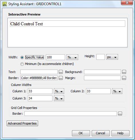
Style Tab – Styling Assistant

|
Property |
Description |
Name1 |
Type1 |
Get1 |
Set1 |
Get/Set Values1 |
|
Width |
Sets the width to one of the following: · A specific value e.g. 300px · The minimum value: this results in the Grid Control being just as wide as it needs to be to accommodate its content Note that this setting will be ignored if the parent container layout specifies a horizontal cell alignment of fill (this applies to Horizontal Box, Vertical Box and Column layouts). This is equivalent to specifying 100% above. Warning: when a specific value is set, any margins will be in addition to the specified value and can cause the Grid Control to “break out” of its parent space. Click here for further info. See also: hints and tips, understanding width. |
width |
Character |
Yes |
Yes |
As per CSS width property. Child: equivalent to minimum |
|
Height |
Sets the height. See understanding height. |
height |
Character |
Yes |
Yes |
As per CSS height property |
|
Text |
Sets the text properties for any child controls: font, size, color, bold, italic etc. See text properties. |
|
|
|
|
|
|
Background |
Sets the background for the entire Grid Control. See background properties. |
|
|
|
|
|
|
Specifies a border for the entire Grid Control. See border properties. By default, the grid border (this property) and grid cell borders (see below) are merged using CSS property border-collapse:collapse. This behaviour can be removed by specifying border-collapse:separate in the Advanced Properties style property, in which case the two borders are drawn separately. |
|
|
|
|
|
|
|
Margin |
Margin is the space between a control and its neighbours. See margin properties. |
|
|
|
|
|
|
Sets the widths for
all table columns |
columnWidths |
Character |
Yes |
Yes |
A comma separated list of widths in the form: col1%,col2%,col3% |
|
|
Column n |
The width of each column |
|
|
|
|
|
|
Grid Cell
Properties: |
Following properties
apply to all grid cells. They can be overridden by specifying properties for individual
Grid Cell Controls. |
|
|
|
|
|
|
Border |
Border properties for each cell. See border properties. See also the Grid Control border property above. |
cellBorder |
|
|
|
|
|
|
|
|
|
|
|
|
|
Style |
CSS class and inline style applied to the table used to contain the grid. |
cssClass style |
Character |
Yes |
Yes |
As per HTML class parameter As per HTML style parameter |
|
Grid style |
Same as the Style property above. Use Style in preference to this property. |
gridClass gridStyle |
Character |
Yes |
Yes |
As per HTML class parameter As per HTML style parameter |
1 See accessing control properties from scripts
Examples of setting properties via API based language:
controls.GRIDCONTROL1.width
= "1000px";
controls.GRIDCONTROL1.textColor
= "#999999";
controls.GRIDCONTROL1.backgroundColor
= "#FFFFCC";
controls.GRIDCONTROL1.columnWidths
= "40%,10%,10%,40%";
controls.GRIDCONTROL1.cellBorder.borderColor
= "red";
controls.GRIDCONTROL1.cssClass
= "class1 class2";
Examples of setting properties via FPL:
set GRIDCONTROL1.width = '1000px';
set GRIDCONTROL1.textColor = '#999999';
set GRIDCONTROL1.backgroundColor = '#FFFFCC';
set GRIDCONTROL1.columnWidths =
'40%,10%,10%,40%';
set GRIDCONTROL1.cellBorder.borderColor = 'red';
set GRIDCONTROL1.cssClass = 'class1 class2';
Html Element Properties Tab
This allows you to add element properties to the root element of the Control – see Html Element Properties for more information.
Right Click Menu Actions
Click here for right-click menu actions available to all controls.
Grid Control right click actions:
- Add Row
- Add Column
- Delete All Grid Cells – deletes all rows and columns
See also Grid Cell Control right click actions.
Control Widget
The Grid Control widget is shown when the control is selected in the WYSIWYG View:
![]()
It supports adjustment of grid column widths. Note that there can be discrepancies between the column widths shown in the widget and the column widths shown immediately below in the WYSIWYG View, click here for further details. Grid cell widths can also be set
Hints and Tips
Control overflows to the right
The Grid Control seems to break out of the parent control space. This problem typically occurs when a left margin has been configured for the Grid Control. Click here for solutions to this problem.
Appearance in Outline View
A Grid Control is shown with the control name in brackets:
![]()
Grid Cell Control
Description
A Grid Cell Control represents a single cell within a Grid Control. It is a system control and cannot be inserted or deleted manually; rather Grid Cell Controls are added and deleted automatically as a result of designer actions such as insert column, delete column etc.
Each Grid Cell Control acts as a container for any content added to it.
Designer Functionality
See Grid Control designer functionality.
Properties
See also control common properties and local/inherited control properties.
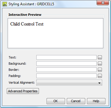
Style Tab – Styling Assistant

|
Property |
Description |
Name1 |
Type1 |
Get1 |
Set1 |
Get/Set Values1 |
|
Text |
Sets the text properties for any child controls: font, size, color, bold, italic etc. See text properties. |
|
|
|
|
|
|
Background |
Sets the background for the Grid Cell. See background properties. |
|
|
|
|
|
|
Border |
Specifies a border for the Grid Cell. See border properties. See also Grid Control border property above. |
|
|
|
|
|
|
Padding |
Padding is the space between the Grid Cell’s content and its border. See padding and margin properties. |
|
|
|
|
|
|
Vertical Alignment |
Aligns the cells contents vertically as a whole. |
vAlign |
Character |
Yes |
Yes |
Click here for values. Value Fill is not supported. |
|
|
|
|
|
|
|
|
|
Style |
CSS class and inline style applied to the <td> tag used to contain the grid cell. |
cssClass style |
Character |
Yes |
Yes |
As per HTML class parameter As per HTML style parameter |
Html Element Properties Tab
This allows you to add element properties to the root element of the Control – see Html Element Properties for more information.
Layout tab
|
Property |
Description |
Name1 |
Type1 |
Get1 |
Set1 |
Get/Set Values1 |
|
Layout type |
Defines the layout used to lay out all child controls |
layout |
Character |
Yes |
No |
|
1 See accessing control properties from scripts
Examples of setting properties via API based language:
controls.GRIDCELL1.textColor
= "#999999";
controls.GRIDCELL1.backgroundColor
= "#FFFFCC";
controls.GRIDCELL1.vAlign
= "Top";
controls.GRIDCELL1.cssClass
= "class3";
Examples of setting properties via FPL:
set GRIDCELL1.textColor = '#999999';
set GRIDCELL1.backgroundColor = '#FFFFCC';
set GRIDCELL1.vAlign = 'Top';
set
GRIDCELL1.cssClass = 'class3';
Right Click Menu Actions
Click here for control common right-click menu actions.
Grid Cell Control right click actions: (options presented vary according to the context)
- Insert Row(s)
- Delete Row(s)
- Insert Column(s)
- Delete Column(s)
- Delete Cell Contents
- Merge Cells
- Split Cell(s)
See also Grid Control right click actions.
Appearance in Outline View
A Grid Cell Control is shown with the row and column, followed by the control type, then the control name in brackets:
![]()
For merged cells, the row and column of the merged cell range is shown:
![]()