Styling problem - Width Overflow
See also: Understanding width, How to introduce spacing between controls, Containers
Keywords: break-out, overflow, overrun
The Problem
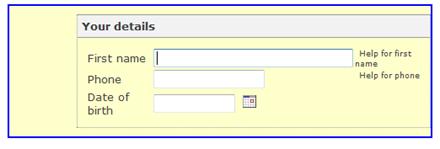
On occasion, a control can appear to break out of the space occupied by its parent. An example is shown below:

In this example, the parent control is a Panel Control with a pale yellow background and a blue border, and it has a child Group Panel Control that has overflowed to the right.
Although this is nearly always not the the desired result, it is in fact normal behaviour and results from the CSS box model which says that any specified padding, borders or margin should be added to an element’s declared width. In the example above the Your Details Group Panel Control has a width of 100%, which means use the full width of its parent – the Panel Control. But a left margin is also specified and this has been added to its width which takes it beyond the width of its parent. The CSS box model is described in more detail here.
This problem can occur with any control, but is most likely to occur with containers. And it can occur with any width specification, but is most likely to occur with width 100%. It can also occur with height.
The most common scenarios are:
- The overflowing control is any container control with an explicit width specification and a left or right margin
- The overflowing control is a Panel Control with an explicit width specification and padding and/or borders
- The overflowing control is not a container control but has an explicit width specification and margins, border or padding have been specified
The Solution
There are a number of possible solutions, and these are listed in order of ease of use (easiest first):
1. If the overflowing control is a Panel Control and the overflow is caused by padding or borders, change the width specification on the Panel Control to Maximum. With this specification the padding and borders will be adjusted to fit within the parent control space.
2. If the overflow is caused by margins, then remove the margin properties and use a Spacer Control instead. A Spacer Control could also be used to replace padding when there is no border or background.
3. Reduce the width of the overflowing element e.g. if the width of the parent control is 300px and the requirement is to add a child container control with a left 50px margin, set the width of the child container control to 250px.
4. Use padding instead of margins. This will produce the same result when there is no border or background. See padding and margins.
The example above is fixed with option 2 – adding a Spacer Control and removing the margin from the Group Panel Control:

There is a general acceptance that the CSS box model has problems. To address this, CSS3 (which is currently a draft specification) includes a new property box-sizing to address this issue. However this property is not supported by either Internet Explorer 6.0 or 7.0 so can only be used when support for these browsers is not required.