Column Layout
Horizontal
and Vertical Alignment
How
to remove spacing between controls
See also: Containers, Layouts, Using Liquid Layouts, Introduction to Styling, Styling Assistants, Controls
Description
Each Column Layout has a defined number of columns. Child controls are laid out in a grid formation where each child control is placed in the next available table cell e.g. if the Column Layout has two columns, the first control is displayed in row 1 column 1, the second in row 1 column 2, the third in row2 column1, the fourth in row2 column2 etc.
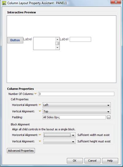
The following example shows a Column Layout with 3 columns.

Layout Properties
Layout properties are accessed by clicking the Layout properties property of any container control that has a layout type set to Column.

Qualifier: layoutProperties.COLUMN
|
Property |
Description |
Name1 |
Type1 |
Get1 |
Set1 |
Get/Set Values1 |
|
Number Of Columns |
Defines the number of columns in each row. |
columns |
Integer |
Yes |
Yes |
|
|
|
|
|
|
|
|
|
|
Horizontal Alignment |
Sets horizontal alignment for each child control within its table cell. This property is only effective when there is sufficient space to allow horizontal repositioning. This property can be overridden for individual controls using the Override layout property. Options are:
|
cellHAlign |
Character |
Yes |
Yes |
Click here for values. |
|
Vertical Alignment |
Sets vertical alignment for each child control within its table cell. This property is only effective when there is sufficient space to allow vertical repositioning. This property can be overridden for individual controls using the Override layout property. Options are:
|
cellVAlign |
Character |
Yes |
Yes |
Click here for values. Value Fill is not supported. |
|
Padding |
The padding to be applied to each table cell. This has the effect of separating each child control from its neighbours. This property can be overridden for individual controls using the Override layout property. |
See padding properties |
|
|
|
|
|
Block Alignment: |
|
|
|
|
|
|
|
Horizontal Alignment |
Sets horizontal alignment for all child controls of the container as a whole e.g. setting this property to center will place all controls in the center of the container’s horizontal space. Options are:
Set this property to Fill to achieve a liquid layout - where widths are specified as percentages based on the current width of the browser window and the page content expands to fill the available width. |
hAlign |
Character |
Yes |
Yes |
Click here for values. |
|
Vertical Alignment |
Sets vertical alignment for all child controls of the container as a whole e.g. setting this property to center will place all controls in the center of the container’s vertical space. This property is only effective when the container is tall enough to accommodate vertical repositioning of its children e.g. the height has been set explicitly using the container’s height property. Options are:
|
vAlign |
Character |
Yes |
Yes |
Click here
for values. |
|
|
|
|
|
|
|
|
|
Layout table style |
tableClass tableStyle |
Character |
Yes |
Yes |
As per HTML class parameter As per HTML style parameter |
|
|
Layout cell style |
See Advanced Properties. This property can be overridden for individual controls using the Override layout property. |
layoutClass layoutStyle |
Character |
Yes |
Yes |
As per HTML class parameter As per HTML style parameter |
1 See accessing control properties from scripts
Examples of setting properties via API based language:
controls.PANEL1.layout.columns
= 6;
controls.PANEL1.layout.cellVAlign
= "Top";
controls.PANEL1.layout.allPadding
= "20px";
controls.PANEL1.layout.tableClass
= "myLayoutTableClass";
controls.PANEL1.layout.layoutStyle
= "padding-top:5px;padding-bottom:5px;";
Examples of setting properties via FPL:
set
PANEL1.layoutProperties.COLUMN.columns = 6;
set
PANEL1.layoutProperties.COLUMN.cellVAlign = 'Top';
set
PANEL1.layoutProperties.COLUMN.allPadding = '20px';
set PANEL1.layoutProperties.COLUMN.tableClass =
'myLayoutTableClass';
set PANEL1.layoutProperties.COLUMN.layoutStyle =
'padding-top:5px;padding-bottom:5px;';
Advanced Properties
A Column Layout lays out its child controls in a table. The Advanced Properties button allows specification of CSS classes and inline style for the table (<table>) and table cell (<td>) tags.
Hints and Tips
Liquid Layouts using % widths
Click here for an example of using a liquid layout where widths are specified as percentages based on the current width of the browser window and the page content expands to fill the available width. A liquid layout will adjust itself dynamically as the width of the browser adjusts e.g. when the orientation of a tablet or mobile phone is changed.
Horizontal and Vertical Alignment
To set horizontal or vertical alignment, use the cell properties in most cases.
How to remove spacing between controls
To completely remove the gaps between adjacent child controls, set a padding of 0px.