Table Column Widths
Introduction
It is
possible for a conflict to exist between a width configured by the designer and
the width that will be rendered by a browser. A browser can decide to adjust
table column widths in order to accommodate table cell content e.g. a textarea that is wider than the declared width, or a text
with the nowrap
CSS attribute. In general this browser behaviour is advantageous in that it
allows a page to dynamically adapt to changing data content and stops displayed
data from being truncated or overlaid.
This
conflict becomes visible in the WYSIWYG View when a control widget is displayed
that allows table column widths to be configured e.g. for a Grid Control, Table
Control or Field Grid Layout.
To cater
for this conflict, the WYSIWYG View can operate in two modes:
- Fixed width
- Automatic width
This is
controlled by the Toggle designer view
toggle switch ![]() on the WYSIWYG tool bar. When selected, fixed
width mode is used; when unselected, automatic width mode is used.
on the WYSIWYG tool bar. When selected, fixed
width mode is used; when unselected, automatic width mode is used.
Fixed
Width Mode
With this
mode, all configured widths will be honoured and any content that doesn’t fit
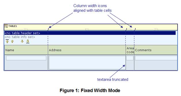
will be truncated. In the WYSIWYG View, column widths shown in a control widget
will be aligned with the table columns as shown in Figure 1 below:

Fixed width
is configured with the following CSS declarations:
- table-layout:fixed; added to the HTML
<table> tag
- overflow:hidden; added
to any <td> tags within the table.
Automatic
Width Mode
With this
mode, table column widths are displayed as they will appear in the browser.
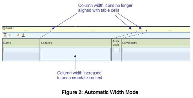
Table cells will be adjusted to accommodate their content. In the WYSIWYG View,
column widths shown in a control widget may not align with the table columns as
shown in Figure 2 below:

Automatic
width mode is the default mode.
Changing
Width Mode
The fixed
width CSS declarations shown above are inserted automatically by the system
into the WYSIWYG View depending on the setting of the Toggle designer view toggle switch.
Note that no insertions are made at form runtime.
Designers
can explicitly change the width mode by configuring these CSS declarations on
the appropriate style properties.