Titled Panel Control
Control overflows to the right
Description
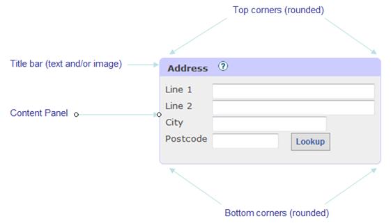
A Titled Panel Control is a container control with a title bar and border, where the title bar can contain a text and/or an image. The control has options to display rounded, square or slashed corners.

Properties
See also control common properties and local/inherited control properties.
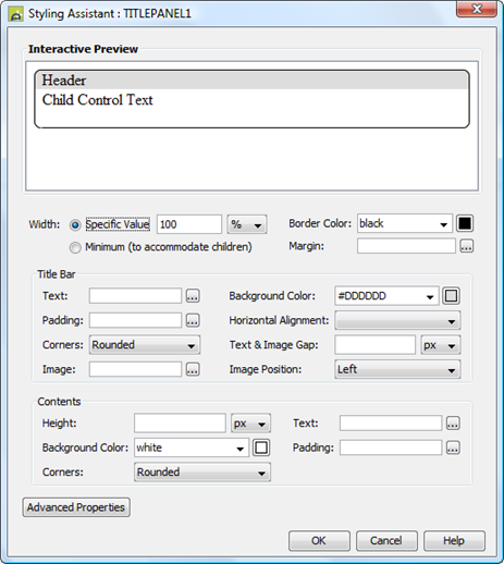
Style Tab – Styling Assistant

|
Property |
Description |
Name1 |
Type1 |
Get1 |
Set1 |
Get/Set Values1 |
|
Width |
Sets the width to one of the following: · A specific value e.g. 300px · The minimum value: this results in the Titled Panel Control being just as wide as it needs to be to accommodate its content Note that this setting will be ignored if the parent container layout specifies a horizontal cell alignment of fill (this applies to Horizontal Box, Vertical Box and Column layouts). This is equivalent to specifying 100% above. Warning: when a specific value is set, any margins will be in addition to the specified value and can cause the Titled Panel Control to “break out” of its parent space. Click here for further info. See also: hints and tips, understanding width. |
width |
Character |
Yes |
Yes |
As per CSS width property Child: equivalent to minimum |
|
Border Color |
This color is applied to the border surrounding the control, including the corners. |
titlePanelBorderColor |
Character Character |
Yes |
Yes |
As CSS color property |
|
Margin |
Margin is the space between a control and its neighbours. See margin properties. |
|
|
|
|
|
|
Title Bar: |
Following properties
apply to the title bar |
|
|
|
|
|
|
Text |
Title text properties: font, size, color, bold, italic etc. See text properties. |
titleBarStyle .xxx |
|
|
|
|
|
Background Color |
Title bar background color. |
titlebarColor |
Character |
Yes |
Yes |
As CSS background-color property |
|
Padding |
Padding is the space between the title text/image and the border. See padding and margin properties. |
titleBarStyle .xxx |
|
|
|
|
|
Horizontal Alignment |
Sets horizontal alignment. Both the title text and image are aligned together as a block. |
titleBarStyle .hAlign |
Character |
Yes |
Yes |
Click here for values. Value Fill is not supported. |
|
Corners |
The style of corner applied to the top left and top right corners. Options are: · Rounded – corners are drawn with a rounded image · Square – corners are square
|
titlebarCornerType |
Character |
Yes |
Yes |
Rounded, Square, Slash |
|
Text & Image Gap |
Gap between the title text and optional image |
textImageGap |
Character |
Yes |
Yes |
As CSS font-size property |
|
Image |
Configuration properties for the optional image: width, height, borders. See image properties. |
imageProperties |
|
|
|
|
|
Image Position |
Position of the optional image relative to the text. Options are Left and Right and None. |
imagePosition |
Character |
Yes |
Yes |
Left, Right, None |
|
Contents: |
Following properties
apply to the content area where child controls are shown as configured by the
layout type property. |
|
|
|
|
|
|
Height |
Sets the height of the content area. |
contentHeight |
Character |
Yes |
Yes |
As per CSS height property |
|
Text |
Sets the text properties for any child controls: font, size, color, bold, italic etc. See text properties. |
contentText |
|
|
|
|
|
Background Color |
Content area background color. |
panelColor |
Character |
Yes |
Yes |
As CSS background-color property |
|
Padding |
Padding is the space between the content and its border. See padding and margin properties. |
contentPadding |
|
|
|
|
|
Corners |
The style of corner applied to the bottom left and bottom right corners. Options are: · Rounded – corners are drawn with a rounded image · Square – corners are square
|
panelCornerType |
Character |
Yes |
Yes |
Rounded, Square, Slash |
|
|
|
|
|
|
|
|
|
Style |
CSS class and inline style applied to the outer table container. See Advanced Properties below. |
cssClass style |
Character |
Yes |
Yes |
As per HTML class parameter As per HTML style parameter |
|
Text Style |
CSS class and inline style applied to the text on the title bar. See Advanced Properties below. |
textClass textStyle |
Character |
Yes |
Yes |
As per HTML class parameter As per HTML style parameter |
|
Image Style |
CSS class and inline style applied to the image on the title bar. See Advanced Properties below. |
imageClass imageStyle |
Character |
Yes |
Yes |
As per HTML class parameter As per HTML style parameter |
|
Content Style |
CSS class and inline style applied to the content area. See Advanced Properties below. |
panelClass panelStyle |
Character |
Yes |
Yes |
As per HTML class parameter As per HTML style parameter |
|
Title Bar Style |
CSS class and inline style applied to the entire title bar. See Advanced Properties below. |
titlebarClass titlebarStyle |
Character |
Yes |
Yes |
As per HTML class parameter As per HTML style parameter |
Html Element Properties Tab
This allows you to add element properties to the root element of the Control – see Html Element Properties for more information.
Layout Tab
|
Property |
Description |
Name1 |
Type1 |
Get1 |
Set1 |
Get/Set Values1 |
|
Layout type |
Defines the layout used to lay out all child controls in the content area. |
layout |
Character |
Yes |
No |
|
|
Layout properties |
Shown when a layout type is specified. Click to display the styling assistant for the selected layout. |
|
|
|
|
|
Title Bar
|
Property |
Description |
Name1 |
Type1 |
Get1 |
Set1 |
Get/Set Values1 |
|
Text |
The title bar text. |
text |
Character |
Yes |
Yes |
|
|
Image URL |
URL of the optional image to be displayed on the title bar. See URL properties for more information. |
imageURL |
Character |
Yes |
Yes |
|
|
Image alternate text |
Alternate text applied to the image. |
imageAltText |
Character |
Yes |
Yes |
|
|
Image mouse over text |
Mouse over text applied to the image. |
imageMouseOverText |
Character |
Yes |
Yes |
|
1 See accessing control properties from scripts
Examples of setting properties using Javascript:
controls.TITLEPANEL1.width
= "1000px";
controls.TITLEPANEL1.text.text
= "new title text";
controls.TITLEPANEL1.titlePanelBorderColor
= "#FFFFCC";
controls.TITLEPANEL1.titleBarStyle.textBold
= "Bold";
controls.TITLEPANEL1.titleBarStyle.hAlign
= "Right";
controls.TITLEPANEL1.panelColor
= "yellow";
controls.TITLEPANEL1.contentPadding.allPadding
= "10px";
controls.TITLEPANEL1.contentText.textColor
= "black";
controls.TITLEPANEL1.imageURL
= "images/image10.gif";
controls.TITLEPANEL1.imageProperties.imageHeight
= "50px";
controls.TITLEPANEL1.imageProperties.borderWidth
= "5px"; // image border width
controls.TITLEPANEL1.cssClass
= "tableClassxx";
Examples of setting properties using FPL:
set
TITLEPANEL1.width = '1000px';
set TITLEPANEL1.text
= 'new title text';
set
TITLEPANEL1.titlePanelBorderColor = '#FFFFCC';
set TITLEPANEL1.titleBarStyle.textBold
= 'Bold';
set
TITLEPANEL1.titleBarStyle.hAlign = 'Right';
set
TITLEPANEL1.panelColor = 'yellow';
set
TITLEPANEL1.contentPadding.allPadding = '10px';
set
TITLEPANEL1.contentText.textColor = 'black';
set
TITLEPANEL1.imageURL = 'images/image10.gif';
set
TITLEPANEL1.imageProperties.imageHeight = '50px';
set
TITLEPANEL1.imageProperties.borderWidth = '5px'; // image border width
set
TITLEPANEL1.cssClass = 'tableClassxx';
Advanced Properties
The Advanced Properties listed above can be used as illustrated below:

Hints and Tips
Control overflows to the right
The Titled Panel Control seems to break out of the parent control space. This problem typically occurs when a left margin has been configured for the Titled Panel Control. Click here for solutions to this problem.
Right Click Menu Actions
Click here for right-click menu actions available to all controls.
There are no specific right click actions for this control.
Appearance in Outline View
A Titled Panel Control is shown with the control name in brackets:
