Text Control
HTML is displayed as text in the WYSIWYG View
How to specify space above and below a text
See also: Working With Texts, Shared Texts Files, Styling Assistants, Introduction to Styling, Controls, Layouts
Description
A Text Control represents a text. Each text control can display any form/component or shared text. Texts can contain formatting HTML. See Working With Texts for more information on the available texts functionality. A Text Control is created by dragging the Text Control icon from the palette which then displays a dialog where the text can be entered. Once created, the text can be changed by double clicking on the text as it appears in the WYSIWYG View or by clicking the … button adjacent to the Text property.
Properties
See also control common properties and local/inherited control properties.
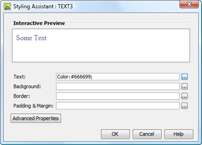
Style Tab - Styling Assistant

|
Property |
Description |
Name1 |
Type1 |
Get1 |
Set1 |
Get/Set Values1 |
|
Text |
Text properties: font, size, color, bold, italic etc. See text properties. |
|
|
|
|
|
|
Background |
See background properties. |
|
|
|
|
|
|
Border |
Border properties for the text box. See border properties. |
|
|
|
|
|
|
Padding & Margin |
Padding is the space between the text and the border. Margin is the space beyond the border. See padding and margin properties. Only left and right padding/margin properties are supported. Specify top and bottom padding/margin by wrapping the Text Control in a Panel Control and add the padding/margin properties to this. Alternatively, use a Spacer Control. |
|
|
|
|
|
|
|
|
|
|
|
|
|
|
Style |
CSS class and inline style for the text. |
cssClass style |
Character |
Yes |
Yes |
As per HTML class parameter As per HTML style parameter |
Html Element Properties Tab
This allows you to add element properties to the root element of the Control – see Html Element Properties for more information.
Texts tab
|
Property |
Description |
Name1 |
Type1 |
Get1 |
Set1 |
Get/Set Values1 |
|
Text |
The displayed text. Click here for information on changing this property using FPL. |
text |
Character |
Yes |
Yes |
|
1 See accessing control properties from scripts
Examples of setting properties using Javascript:
controls.TEXT1.textColor
= "#FF0099";
controls.TEXT1.backgroundColor
= "yellow";
controls.TEXT1.text.text
= "A new text";
Examples of setting properties using FPL:
set TEXT1.textColor = '#FF0099';
set TEXT1.backgroundColor = 'yellow';
set TEXT1.text = 'A new text';
Hints and Tips
HTML is displayed as text in the WYSIWYG View
WARNING: the system renders the page as XHTML in the WYSIWYG View, and not all HTML content is considered valid within the XHTML standard. This can sometimes cause unexpected results when HTML content is added to a page. Click here for further information.
How to specify space above and below a text
Only left and right padding/margin properties are supported by this control. Specify top and bottom padding/margin by wrapping the Text Control in a Panel Control and add the padding/margin properties to this. Alternatively, use a layout gap or a Spacer Control – click here for more information.
Right Click Menu Actions
Click here for right-click menu actions available to all controls.
There are no specific right click actions for this control.
Appearance in Outline View
A Text Control is shown with the control name in brackets:
![]()