Message Options for Controls
See also: Message Control, Working with Messages
Introduction
This document discusses where error, warning and info messages are displayed to the user and how these can be configured. This includes:
- Messages are issued by scripts e.g. using the FPL message command or one of the API addxxxMessage() methods. When a message is issued from a control-level event, the message will be displayed according to the configured message options for the control where the event is configured. When a message is issued from a page-level event, any messages are associated with the Page Control which is the root control on each page.
- System messages issued by field validators
- System messages generated by server-side field validation: mandatory and field type checks
Message Options
There are two main options for locating messages: Local and Message Control
Local
Messages will be displayed local (adjacent) to the owning control.
Messages are not displayed when the owning control or one of its parent controls is hidden. Use a Message Control to display a message where the owning control is hidden.
The exact location of the messages depends on the layout of its parent and is as follows:
- Flow Layout: after the control
- All other layouts: above the control
There are some additional circumstances where no layout exists and therefore the above rules don’t apply:
- Messages for table columns are displayed above the table row.
- Messages for menu on click events:
- When issued from an on click event specified in the Menu Control, messages are attached to the Menu Control and are displayed by the parent layout as described above.
- When issued from an on click event specified in a Menu Item Control (via the Override On Click property), messages are attached to the Menu Item Control and displayed after the control.
There may be some circumstances where the location or appearance of local messages is not suitable; in this case, you should consider using a Message Control instead.
Message Control
The messages will apear at the location of the selected Message Control. Any number of Message Controls can be added to a page and messages can be directed to different Message Controls as required.
Use Parent Control
An additional option Use parent control setting is provided to make it easier to configure message options. When selected, this means that the system will obtain the message option (local or Message Control) from the control’s parent instead of the control itself. When the parent option is set to Message Control, messages are directed to the Message Control configured for the parent control; when the parent option is set to Local, messages are displayed local to the owning control i.e. the control issuing the message. This is illustrated by the following example: the requirement here is that all messages within a group should be located next to the Field Control to which the message applies; this is achieved by setting each child Field Control to use message option Use parent and configuring the Group Control parent to use message option Local.

The Use parent option can be propagated upwards to the root Page Control if required: when the Page Control option is set to use a Message Control, all messages for the page are then directed to that Message Control.
Control Message Option Dialog
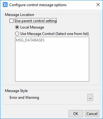
Double clicking on the Message Options property for a control displays the message options dialog, which provides options on where a message is displayed in the output page and its appearance.

Properties
|
Property |
Description |
Name1 |
Type1 |
Get1 |
Set1 |
Get/Set Values1 |
|
Use parent control setting |
Use parent control setting: indicates that the message options properties should be taken from the parent control. |
inheritMsg |
Boolean |
Yes |
No |
|
|
Local Message/ Use Message Control |
Local message: indicates that messages will be displayed locally to the control that issued the message. Use Message Control(s): indicates that messages should be displayed by the selected message controls – these are selected in the following box. This option can be used to direct all messages or certain messages to a specific location on a page. |
localMsg |
Boolean |
Yes |
No |
|
|
Message Controls |
A comma delimited list of message control names |
msgControls |
Character |
Yes |
Yes |
|
|
Message Style |
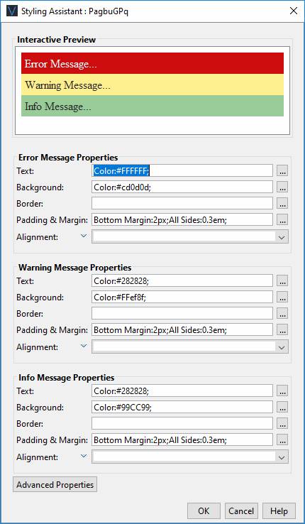
Displays the styling assistant dialog shown below |
|
|
|
|
|
Style Tab – Styling Assistant
The Styling Assistant supports styling of error, warning and info messages.

|
Property |
Description |
Name1 |
Type1 |
Get1 |
Set1 |
Get/Set Values1 |
|
Error Message
Properties |
The following properties apply to error messages. |
|
|
|
|
|
|
Text |
Sets the text properties for messages: font, size, color, bold, italic etc. See text properties. |
errorMessageStyle .xxx |
|
|
|
|
|
Background |
Sets the background properties messages. See background properties. |
errorMessageStyle .xxx |
|
|
|
|
|
Border |
Sets the border properties for messages. See border properties. |
errorMessageStyle .xxx |
|
|
|
|
|
Padding & Margin |
Sets the padding and margin properties for messages. See padding/margin properties. |
errorMessageStyle .xxx |
|
|
|
|
|
Alignment |
Horizontal alignment for messages within each message container. |
errorMessageStyle .hAlign |
Character |
Yes |
Yes |
Click here for values. Value Fill is not supported. |
|
Warning Message
Properties |
The following properties apply to warning messages. |
|
|
|
|
|
|
Text |
Sets the text properties for messages: font, size, color, bold, italic etc. See text properties. |
warningMessageStyle .xxx |
|
|
|
|
|
Background |
Sets the background properties messages. See background properties. |
warningMessageStyle .xxx |
|
|
|
|
|
Border |
Sets the border properties for messages. See border properties. |
warningMessageStyle .xxx |
|
|
|
|
|
Padding & Margin |
Sets the padding and margin properties for messages. See padding/margin properties. |
warningMessageStyle .xxx |
|
|
|
|
|
Alignment |
Horizontal alignment for messages within each message container. |
warningMessageStyle .hAlign |
Character |
Yes |
Yes |
Click here for values. Value Fill is not supported. |
|
Info Message
Properties |
The following properties apply to info messages. |
|
|
|
|
|
|
Text |
Sets the text properties for messages: font, size, color, bold, italic etc. See text properties. |
infoMessageStyle .xxx |
|
|
|
|
|
Background |
Sets the background properties messages. See background properties. |
infoMessageStyle .xxx |
|
|
|
|
|
Border |
Sets the border properties for messages. See border properties. |
infoMessageStyle .xxx |
|
|
|
|
|
Padding & Margin |
Sets the padding and margin properties for messages. See padding/margin properties. |
infoMessageStyle .xxx |
|
|
|
|
|
Alignment |
Horizontal alignment for messages within each message container. |
infoMessageStyle .hAlign |
Character |
Yes |
Yes |
Click here for values. Value Fill is not supported. |
|
|
|
|
|
|
|
|
|
Error Message |
CSS class and inline style for error messages. |
errorMsgClass errorMsgStyle |
Character |
Yes |
Yes |
As per HTML class parameter As per HTML style parameter |
|
Warning Message |
CSS class and inline style for warning messages. |
warningMsgClass warningMsgStyle |
Character |
Yes |
Yes |
As per HTML class parameter As per HTML style parameter |
|
Info Message |
CSS class and inline style for info messages. |
infoMsgClass infoMsgStyle |
Character |
Yes |
Yes |
As per HTML class
parameter As per HTML style
parameter |
1 See accessing control properties from scripts
Examples of setting properties via API based language:
controls.PANEL1.errorMessageStyle.textColor
= "#FF0000";
controls.PANEL1.errorMessageStyle.backgroundColor
= "#0000FF";
controls.PANEL1.errorMessageStyle.hAlign
= "Center";
controls.PANEL1.warningMessageStyle.textColor
= "black";
controls.PANEL1.warningMessageStyle.backgroundColor
= "yellow";
Examples of setting properties via FPL:
set PANEL1.errorMessageStyle.textColor =
'#FF0000';
set PANEL1.errorMessageStyle.backgroundColor =
'#0000FF';
set PANEL1.errorMessageStyle.hAlign = 'Center';
set PANEL1.warningMessageStyle.textColor =
'black';
set PANEL1.warningMessageStyle.backgroundColor =
'yellow';