Heading Control
See also: Containers, Introduction to Styling, Styling Assistants, Controls
Description
A Heading Control (not to be confused with a Header Control) represents one of the HTML heading tags <h1> – <h6>, where the control’s Level property specifies which HTML tag to use. The Outline View shows which level has been selected. Typically a Heading Control will just contain a text but it can also contain phrasing content – which consists of the following child controls: Text Controls, Hyperlink Controls, Canvas Controls, Image Controls and HTML Controls.
When a Heading Control has no child controls, the heading text configured using the text property is displayed.
When a Heading Control has child controls it behaves in a different mode: the heading text configured in the text property is ignored and the control is rendered using the child controls – with the expectation that any text will be included in a child Text Control.
When adding the first child Text Control, the system will automatically copy the text configured in the Text property. When adding an Image Control or a Canvas Control, an additional Text Control is also created if one doesn’t already exist and the Text property is configured.
Advice on use of headings
- Avoid using heading tags just to resize text. Instead, use the CSS font-size property. Headings use size to indicate their relative importance, but CSS is preferred for general-purpose resizing.
- Nest headings using their level. The most important heading has the level 1 (<h1>), the least important heading level 6 (<h6>). Headings with an equal or higher level are interpreted by screen readers as the start of a new section, headings with a lower level are interpreted as the start of new subsections that are part of the higher ranked section.
- You should only use one <h1> per page. Using more than one will not result in an error, but using only one is seen as a best practice.
- Skipping heading levels can be confusing and should be avoided where possible: Make sure that a <h2> is not followed directly by an <h4>, for example. It is ok to skip levels when closing subsections, for instance, a <h2> beginning a new section, can follow an <h4> as it closes the previous section.
Accessibility notes:
- Organizing web pages by headings helps users get a sense of the page’s organization and structure. Visually, headings are presented as larger and more distinct than surrounding text. Making texts larger helps guide the eye around the page. Using headings and making them visually apparent is especially helpful for users with cognitive disabilities.
- Screen reader users can navigate a page according to its headings, listen to a list of all headings, and skip to a desired heading to begin reading at that point. Screen reader users can use headings to skip the repeated blocks of content like headers, menus, and sidebars, for example.
- See Designing Accessible Applications
Properties
See also control common properties and local/inherited control properties.
General Tab
|
Property |
Description |
Name1 |
Type1 |
Get1 |
Set1 |
Get/Set Values1 |
|
Level |
Specifies which HTML heading tag <h1> - <h6> is generated |
level |
Number |
Yes |
Yes |
1 - 6 |
Texts Tab
|
Property |
Description |
Name1 |
Type1 |
Get1 |
Set1 |
Get/Set Values1 |
|
Text |
Header text. This text is only used when the control has no child controls. |
text |
Character |
Yes |
Yes |
|
Html Element Properties Tab
This allows you to add element properties to the root element of the Control – see Html Element Properties for more information.
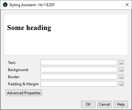
Style Tab - Styling Assistant

|
Property |
Description |
Name1 |
Type1 |
Get1 |
Set1 |
Get/Set Values1 |
|
Text |
Text properties: font, size, color, bold, italic etc. See text properties. |
|
|
|
|
|
|
Background |
See background properties. |
|
|
|
|
|
|
Border |
Border properties for the text box. See border properties. |
|
|
|
|
|
|
Padding & Margin |
Padding is the space between the text and the border. Margin is the space beyond the border. See padding and margin properties. |
|
|
|
|
|
|
|
|
|
|
|
|
|
|
Style |
CSS class and inline style for the text. |
cssClass style |
Character |
Yes |
Yes |
As per HTML class parameter As per HTML style parameter |
Right Click Menu Actions
Click here for right-click menu actions available to all controls.
There are no specific right click actions for this control.