Image Control
See also: Styling Assistants, Introduction to Styling, Controls, Layouts
Description
An Image Control represents an image loaded from a URL. Optionally, the image can be treated as a hyperlink and then activates a URL which can either replace the current window or be displayed as a new window. Alternatively, an on click event (i.e. an internal form event) can be specified and this event is executed when the user clicks on the image.
Properties
See also control common properties and local/inherited control properties.
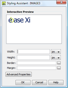
Style Tab - Styling Assistant

|
Property |
Description |
Name1 |
Type1 |
Get1 |
Set1 |
Get/Set Values1 |
|
Width |
Image width. If not specified, the image will be displayed full size. If specified, the image will be scaled to fit. |
imageWidth |
Character |
Yes |
Yes |
As per CSS width parameter |
|
Height |
Image height. If not specified, the image will be displayed full size. If specified, the image will be scaled to fit. |
imageHeight |
Character |
Yes |
Yes |
As per CSS height parameter |
|
Border |
Properties for the image border. See border properties. |
|
|
|
|
|
|
Margin |
Margin is the space beyond the border. See padding and margin properties. |
|
|
|
|
|
|
|
|
|
|
|
|
|
|
Style |
CSS class and inline style for the image. |
cssClass style |
Character |
Yes |
Yes |
As per HTML class parameter As per HTML style parameter |
Html Element Properties Tab
This allows you to add element properties to the root element of the Control – see Html Element Properties for more information.
Image Control tab
|
Property |
Description |
Name1 |
Type1 |
Get1 |
Set1 |
Get/Set Values1 |
|
Image URL |
Specifies the URL for the image. See URL properties for more information. |
imageURL |
Character |
Yes |
Yes |
|
|
Display as hyperlink |
When checked, the image will be treated as a hyperlink. When clicked by the user, the hyperlink URL is displayed (see Hyperlink properties). When not checked, an on click event can be specified. |
displayAsHyperlink |
Boolean |
Yes |
Yes |
|
|
Skip validation |
Specifies that the system will omit all validation prior to executing the on click event. See skip validation for details. |
skipValidation |
Boolean |
Yes |
Yes |
|
Hyperlink tab
|
Property |
Description |
Name1 |
Type1 |
Get1 |
Set1 |
Get/Set Values1 |
|
Hyperlink URL |
This is the Hyperlink URL displayed when Display as hyperlink is selected. See URL properties for more information. |
hyperlinkURL |
Character |
Yes |
Yes |
|
|
Hyperlink target window |
This is the target window id or frame id in which the hyperlink URL is displayed. URL Target Property for more information. |
hyperlinkTarget |
Character |
Yes |
Yes |
|
Events Tab
|
Property |
Description |
Name1 |
Type1 |
Get1 |
Set1 |
Get/Set Values1 |
|
On Click |
This event is executed when the user clicks the image and Display as hyperlink is not selected. Any applicable validation events are run before the on click event. If a validation event fails, the on click event is not executed. See Events for more information. |
|
|
No |
No |
|
Texts tab
|
Property |
Description |
Name1 |
Type1 |
Get1 |
Set1 |
Get/Set Values1 |
|
Alternative Text |
The alternative text for the image (required for accessibility). |
alternativeText |
Character |
Yes |
Yes |
|
|
Mouse Over Text |
Text displayed when the mouse is moved over the image. |
mouseOverText |
Character |
Yes |
Yes |
|
1 See accessing control properties from scripts
Examples of setting properties via API based language:
Examples of setting properties via API based language:
controls.IMAGE1.imageWidth
= "200px";
controls.IMAGE1.allMargin
= "10px";
controls.IMAGE1.imageURL
= fields.URL_FIELD1.value;
Examples of setting properties via FPL:
set
IMAGE1.imageWidth = '200px';
set IMAGE1.allMargin = '10px';
set IMAGE1.imageURL = URL_FIELD1;
Right Click Menu Actions
Click here for right-click menu actions available to all controls.
There are no specific right click actions for this control.
Appearance in Outline View
An Image Control is shown with the control name in brackets:
![]()