Using Liquid Layouts
See also: Containers, Layouts
A Liquid Layout is the term used for a page layout where widths are specified as percentages based on the current width of the browser window and the page content expands to fill the available width. This layout will adjust itself dynamically as the width of the browser adjusts e.g. when the orientation of a tablet or mobile phone is changed. This page describes how to achieve a liquid layout using the standard layouts supplied with Verj.io.
The key thing is not to use an explicit width e.g. px for the page or any lower level container, and instead allow the width specification to default – the default is to use the maximum available width which, in the absence of a specific declaration, will be the width of the browser window.
The rest of this document applies to the use of Horizontal Box Layout and Column Layout. These are the two layouts that allow you to layout child controls horizontally across a page. All other available layouts will dynamically expand to fill the available width without any explicit action.
Horizontal Box and Column Layouts using % widths
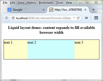
The example below explains how to use a liquid layout using a Horizontal Box Layout where widths are specified as percentages based on the current width of the browser window and the content expands to fill the available width i.e. you want to achieve a result something like this to fill the available width of the browser window:

This is done by setting the layout Block Horizontal Alignment to Fill. The system then tries to ensure that all child controls together fill out the available width of the parent container. Here is an explicit example:
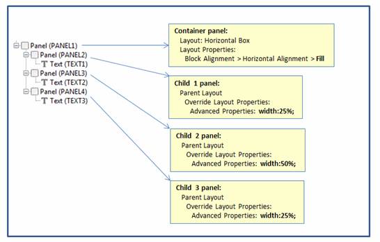
We have a containing Panel Control (PANEL1) with layout set
to Horizontal Box and Block Horizontal Alignment set to Fill. This container has three
Panel Controls (PANEL2, PANEL3, PANEL4) as children,
each one of which contains a Text Control. These child Panel Controls have a
width specified using the CSS width
property of Advanced Properties
within the Override layout property
in the Parent Layout section of each control’s properties. It’s most important that the width is specified using the Override layout property, not the width property for each Panel Control.
The width property for all parent controls is allowed to default to Maximum which means that the width of the browser is used as the 100% value – this will be sub-divided into the explicit % widths that we specify in this example.

This is the result in the browser. The parent container width is taken from the browser window and the child Panel Controls expand to fill the available width. The widths of all parent container controls in this example have their default value of Maximum.

The widths adjust dynamically as the browser width changes:
