Image Column Control
See also: Table Control, Table Basics, Tables Tutorial, Controls, Introduction to Styling, Styling Assistants, Controls, Image Control
Description
An Image Control represents an image in a table column loaded from a URL. Optionally, the image can be treated as a hyperlink and then activates a URL which can either replace the current window or be displayed as a new window. Alternatively, an on click event (i.e. an internal form event) can be specified and this event is executed when the user clicks on the image.
Properties
See also control common properties and local/inherited control properties.
Style Tab – Styling Assistant
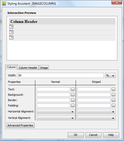
The properties and the Interactive Preview are divided into sections that represent different parts of a Image Column Control. Each section can be selected from the Edit Properties dropdown or by clicking on the appropriate area in the preview. The sections are:
- Column – properties for the table cells
- Column Header – properties for the header
- Image – properties for the image

These properties override the default table column properties specified using the Table Control Styling Assistant.
|
Property |
Description |
Name1 |
Type1 |
Get1 |
Set1 |
Get/Set Values1 |
Column |
The following properties apply to the table column cell data |
|
|
|
|
|
|
Width |
Sets the width of the table column. It is recommended that the same width unit is used for all columns within a table. |
width |
Character |
Yes |
Yes |
As per CSS width property |
|
|
||||||
|
Text |
Text properties for the table column: font, size, color, bold, italic etc. See text properties. |
|
|
|
|
|
|
Background |
Cell background properties for the table column. See background properties. If table striping is specified on the Table Control, the corresponding striped property should also be set. |
|
|
|
|
|
|
Border |
Border properties for the table column. See border properties. |
|
|
|
|
|
|
Padding |
Padding is the space between the table cell contents and the border. See padding and margin properties. |
|
|
|
|
|
|
Horizontal Alignment |
Horizontal alignment of the table cell contents. |
hAlign |
Character |
Yes |
Yes |
Click here for values. Value Fill is not supported. |
|
Vertical Alignment |
Vertical alignment of the table cell contents. |
vAlign |
Character |
Yes |
Yes |
Click here for values. Value Fill is not supported. |
|
Striped: these properties apply to alternate rows. |
||||||
|
Text |
Text properties for the table column: font, size, color, bold, italic etc. See text properties. |
stripeProperties .xxx |
|
|
|
|
|
Background |
Cell background properties for the table column. See background properties. |
stripeProperties .xxx |
|
|
|
|
|
Border |
Border properties for the table column. See border properties. |
stripeProperties .xxx |
|
|
|
|
|
Padding |
Padding is the space between the table cell contents and the border. See padding and margin properties. |
stripeProperties .xxx |
|
|
|
|
|
Alignment |
Horizontal alignment of the table cell contents. |
stripeProperties .hAlign |
Character |
Yes |
Yes |
Click here for values. Value Fill is not supported. |
|
Vertical Alignment |
Vertical alignment of the table cell contents. |
stripeProperties .vAlign |
Character |
Yes |
Yes |
Click here for values. Value Fill is not supported. |
|
|
|
|
|
|
|
|
|
Cell style |
CSS class and inline style applied to the table cells used to present this table column. |
columnCellClass columnCellStyle |
Character |
Yes |
Yes |
As per HTML class parameter As per HTML style parameter |
|
Data style |
CSS class and inline style applied to the table cell data for this column. |
columnDataClass columnDataStyle |
Character |
Yes |
Yes |
As per HTML class parameter As per HTML style parameter |
Column Header |
The following properties apply to the column header |
|
|
|
|
|
|
Text |
Text properties for the column header: font, size, color, bold, italic etc. See text properties. |
columnHeaderProperties .xxx |
|
|
|
|
|
Background |
Column header background properties. See background properties. |
columnHeaderProperties .xxx |
|
|
|
|
|
Border |
Border properties for the column header. See border properties. |
columnHeaderProperties .xxx |
|
|
|
|
|
Padding |
Padding is the space between the column header text and its border. See padding and margin properties. |
columnHeaderProperties .xxx |
|
|
|
|
|
Alignment |
Horizontal alignment of the column header. |
columnHeaderProperties .hAlign |
Character |
Yes |
Yes |
Click here for values. Value Fill is not supported. |
Image |
The following properties apply to the image |
|
|
|
|
|
|
|
||||||
|
Image |
See image properties. |
imageProperties .xxx |
|
|
|
|
|
Striped: these properties apply to alternate rows. |
||||||
|
Image |
See image properties. |
stripedImageProperties .xxx |
|
|
|
|
Html Element Properties Tab
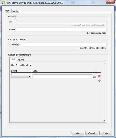
See Html Element Properties Assistant for more information about these properties.
In addition to its Root Element, Html Element Properties can be configured for every image in the column. The Image Control is a repeating element and so the Id Html Element Property is disabled for every element in the Control.
Root Tab
An Image Control is a th element (if you have enabled column headers - see Table Control) and a collection td elements, one for each row. The Root Element is all of these td elements along with the th element; the same Html Element Properties to each of its Root elements.
Image Tab
The Image is a img element and the Html Element Properties are added to every one of them in the column.
Image Control tab
|
Property |
Description |
Name1 |
Type1 |
Get1 |
Set1 |
Get/Set Values1 |
|
Image URL |
Specifies the URL for the image. See URL properties for more information. |
imageURL |
Character |
Yes |
Yes |
|
|
Display as hyperlink |
When checked, the image will be treated as a hyperlink. When clicked by the user, the hyperlink URL is displayed (see Hyperlink properties). When not checked, an on click event can be specified. |
displayAsHyperlink |
Boolean |
Yes |
Yes |
|
|
Skip validation |
Specifies that the system will omit all validation prior to executing the on click event. See skip validation for details. |
skipValidation |
Boolean |
Yes |
Yes |
|
Hyperlink tab
|
Property |
Description |
Name1 |
Type1 |
Get1 |
Set1 |
Get/Set Values1 |
|
Hyperlink URL |
This is the Hyperlink URL displayed when Display as hyperlink is selected. See URL properties for more information. |
hyperlinkURL |
Character |
Yes |
Yes |
|
|
Hyperlink target window |
This is the target window id or frame id in which the hyperlink URL is displayed. URL Target Property for more information. |
hyperlinkTarget |
Character |
Yes |
Yes |
|
Events Tab
|
Property |
Description |
Name1 |
Type1 |
Get1 |
Set1 |
Get/Set Values1 |
|
On Click |
This event is executed when the user clicks the image and Display as hyperlink is not selected. Any applicable validation events are run before the on click event. If a validation event fails, the on click event is not executed. See Events for more information. |
|
|
No |
No |
|
Texts tab
|
Property |
Description |
Name1 |
Type1 |
Get1 |
Set1 |
Get/Set Values1 |
|
Alternative Text |
The alternative text for the image (required for accessibility). |
alternativeText |
Character |
Yes |
Yes |
|
|
Mouse Over Text |
Text displayed when the mouse is moved over the image. |
mouseOverText |
Character |
Yes |
Yes |
|
Column Heading Tab
|
Property |
Description |
Name1 |
Type1 |
Get1 |
Set1 |
Get/Set Values1 |
|
Heading Text |
Column header text. |
headerText |
Character |
Yes |
Yes |
|
1 See accessing control properties from scripts
Examples of setting properties via API based language:
controls.IMAGECOLUMN1.width
= "80px";
controls.IMAGECOLUMN1.imageProperties.imageWidth
= "60px";
controls.IMAGECOLUMN1.imageProperties.imageHeight
= "60px";
controls.IMAGECOLUMN1.backgroundColor
= "#FF99FF";
controls.IMAGECOLUMN1.stripeProperties.backgroundColor
= "#FF33FF";
controls.IMAGECOLUMN1.imageURL
= fields.URL_FIELD1.value;
Examples of setting properties via FPL:
set IMAGECOLUMN1.width = '80px';
set IMAGECOLUMN1.imageProperties.imageWidth =
'60px';
set IMAGECOLUMN1.imageProperties.imageHeight =
'60px';
set IMAGECOLUMN1.backgroundColor = '#FF99FF';
set
IMAGECOLUMN1.stripeProperties.backgroundColor = '#FF33FF';
set IMAGECOLUMN1.imageURL = URL_FIELD1;
Right Click Menu Actions
Click here for right-click menu actions available to all controls.
There are no specific right click actions for this control.
Appearance in Outline View
A Table Image Control is shown with the control name in brackets:
![]()
