Control Styling Properties: Alignment
Setting
alignment using the parent container layout
Relationship
with width and height
This document provides general information on how to apply horizontal and vertical alignment.
Setting alignment using the parent container layout
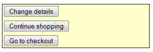
The most important thing to understand about both horizontal and vertical alignment is that in the vast majority of cases, these properties are configured using the layout properties of the parent container. In fact, what is happening is that the control is being aligned within its parent. Consider the following: three buttons in a Panel Control (the parent container) with Vertical Box layout; the Panel Control has been given a border and background for clarity.


These buttons can be aligned centrally by configuring the layout properties of the container (PANEL14). This is achieved by:
- selecting PANEL14
- clicking Layout properties
- setting Horizontal Alignment to fill and Cell Horizontal Alignment to center

Configuring the layout properties on the parent Panel Control has changed the alignment for all child controls – the three buttons. The alignment for just a single control can be configured using the control’s Override layout property. To continue with the same example, the top button could be right aligned by:
- Selecting BUTTON6
- Clicking Override layout
- Setting Horizontal Alignment to right

Please note that the above discussion assumes that the parent control has a layout applied. However this is optional, so how does alignment work when there is no layout? The answer is that alignment can then only be set on the individual controls as described below and this may or may not produce the desired result. Usually, it is much simpler to apply a layout to the parent container.
Relationship with width and height
In the above examples, the parent Panel Control has been given an explicit width and there is sufficient space to reposition the buttons by aligning them left, right or center. However, if the Panel Control’s width is removed, it will be only as wide as it needs to be to accommodate its children – in this case, it will be as wide as the Continue Shopping button as that is the widest. Changing the alignment now has only a small effect, in fact the Continue Shopping button doesn’t move at all.

The principle here is that horizontal alignment only works when the container is wide enough to accommodate horizontal repositioning of its children. The container’s width might be set explicitly using the width property or it might be implicit in which case it will have the width of its widest child. Similarly vertical alignment only works when the container is tall enough to accommodate vertical repositioning of its children. And the container’s height can be set explicitly using the height property or it might be implicit in which case it will have the height of its tallest child.
Setting alignment on controls
As discussed above, the most common requirement is to align a control within its container. However, it is often possible to set horizontal and/or vertical alignment on the individual controls. These properties are rarely supported by the controls’ styling assistants so they need to be set using the applicable CSS properties text-align and vertical-align. These properties are available by clicking the Advanced Properties button in the styling assistants for the individual controls. In general, changing alignment in this way will frequently not produce any noticeable change. This is because the control is being asked to align its content within its own box; however this box is often only as big as it needs to be accommodate its content, so changing the alignment has no effect. There are however, occasions when setting alignment on a control does produce a result e.g. on the right aligned text input box shown below (this is a Field Control):
![]()
Another example of when alignment might be applied to individual controls is when the parent container has no layout. However, this is a relatively difficult way to implement alignment and may not produce the desired result. It’s generally much easier to apply a layout to the parent container then use the layout properties offered by the layout styling assistant as described above.
Further reading
Alignment is discussed further and in more detail for the individual layouts: