Working with Lists
See also: List Layout, How to use Dynamic Lists, How to use Static Lists, Working with Databases
This document describes the various options available to display and configure lists.
Displaying
Static Content as a List
Displaying Dynamic Content as a List
Lists on Input
Fields
Any form field or table column in a form can be associated with a list by configuring the list properties of the field/column. The list is then displayed to the user by adding the field/column to a page. Three types of list are supported:
- A Dynamic
List represents a list of values that are extracted dynamically
from a database at runtime. Examples could include a list of customer
names, or a list of cities, etc. These lists can be linked, e.g. a list of
countries, followed by a list of regions, followed by a list of cities: as
each value is selected, the next list is populated. The list is prepared
when the page is prepared for display.
- A Static List is a list of values stored within the workspace. As the name implies, Static Lists are intended to be used when the list values do not change very often. Examples might be TITLE consisting of values Mr, Miss, Mrs, Dr, etc, or CONTACT_CATEGORY consisting of values Customer, Vendor, Partner, etc. An important aspect of Static Lists is that the list texts can be configured for any language: the appropriate texts are then displayed based on the runtime language for each user. However, the same returned value is used regardless of language. The list is prepared when the first reference to the list is made, and it is cached in memory thereafter.
- A Custom List is a list of values that is created using a script. Here are Javascript examples:
// create simple list with three entries
var list1 = ["Line 1",
"Line 2", "Line 3"];
fields.Field1.createCustomList(list1);
// create list with both displayed and return values
var list2 =
fields.Field1.createCustomList();
list2.add("Display Value 1",
"Returned value 1");
list2.add("Display Value 2",
"Returned value 2");
list2.add("Display Value 3",
"Returned value 3");
Each list can be displayed as a dropdown, radio button or checkbox depending on the form field’s display type.
Each list entry can optionally contain both a displayed value and a returned value. This allows you to display a descriptive name while retaining a key value e.g. if displaying employee details, the department_id field might contain a numeric id but be displayed as the descriptive department name. With a Dynamic List the displayed and returned columns are configured when you map the list to a field.
When a field associated with a list is display only, the displayed value is shown.
The text 'Please Select' or its equivalent in other languages represents a null value and by default appears at the top of each list. This text can be changed or suppressed for individual lists by configuring the Header text options in the list tab of the field’s properties. The default header text is taken from system text 21 – if you would like to change this text for all lists, edit this text.
Displaying Static
Content as a List
To start
with, the word static used in this
context just means that you know at design time what the content will be e.g. a
list of menu items – it has nothing to do with the Static List entity described in the previous section.
Static
content can be built up using a List Panel
Control, then adding List Item Controls
and any other controls to this. For example, a menu with three items could be
configured as:

..displays as:

But this
could also be configured to display as a horizontal menu by including the
appropriate classes on the List Item controls. This is just a simple example: a
List Item Control is a general purpose container control and can be used to
contain any combination of additional controls.
To style
the List Panel Control, select it
then click Control Style to display
its styling dialog. This allows configuration of the list type (unordered or ordered list), the list style type (configures the bullet or number style) and a few
other basic list styling properties. CSS classes can also be added to achieve
any styling not immediately available in the styling dialog. Similarly the List Item Control can be styled by the
addition of CSS classes or via its styling dialog.
Displaying Dynamic Content as a List
A simple
list of texts or hyperlinks based on a list model can be achieved using a List Control in combination with a List Text Control or a List Hyperlink Control. The List Control
requires a list model to supply the list items and there are three options
(these are the same as described for input fields above):
- A Dynamic
List represents a list of values that are extracted dynamically
from a database at runtime.
- A Static List is a list of values stored within the workspace.
- A Custom List is a list of values that is created using a script. Here are Javascript examples:
// create simple list with three entries
var list1 = ["Line 1",
"Line 2", "Line 3"];
controls.myList1.createCustomList(list1);
When one of
these lists is used as the list model for a List Control, only the displayed value of each list item is
displayed; the return value is
ignored.
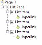
When you
first drag a List Control onto a page, three controls including a List Text Control are added – this List
Text Control displays the list item text for the current row of the list.
![]()
When the
page is displayed, the List Item Control
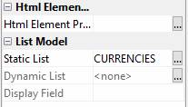
is rendered repeatedly for each item in the list. So if we now configure a
Static List in the List Control’s properties:

The list is
now displayed like this:

To display
this as hyperlinks instead of texts, remove the List Text Control and replace
it with a List Hyperlink Control:

The list is
now displayed like this:

Here is the
same list, now styled as a Bootstrap Nav menu:
![]()
To process
the user clicking on the hyperlink, add a script to the List Hyperlink Control’s
on click event. You can then check which item has been clicked:
var sel = controls.LisHyp1.text.text;
switch (sel)
{
case "US Dollar":
log("User
clicked US Dollar");
break;
case "Euro":
log("User
clicked Euro");
break;
case "GB Pound":
log("User
clicked GB Pound");
break;
}
To style
the List Control, select it then
click Control Style to display its
styling dialog. This allows configuration of the list type (unordered or ordered list), the list style type (configures the bullet or number style) and a few
other basic list styling properties. CSS classes can also be added to achieve
any styling not immediately available in the styling dialog. Similarly the List Item Control can be styled by the
addition of CSS classes or via its styling dialog. A List Text Control just represents the list item text and cannot itself be styled; style the list text by styling its parent
List Text Item. A List Hyperlink Control
can be styled in the same way as a Hyperlink Control.
It’s also
possible to change the style of individual list items by looping through the
list and setting properties on any of the child controls. For example:
var items = controls.LstvIn9L.list.items;
while (items.next())
{
var txt = items.listValue
switch (txt)
{
case "US Dollar":
controls.ListItem1.backgroundColor =
"red";
break;
case "Euro":
controls.ListItem1.backgroundColor =
"green";
break;
case "GB Pound":
controls.ListItem1.backgroundColor =
"yellow";
break;
}
}
The list is
now displayed like this:

This
approach can be extended to make any dynamic change to the display of a list
e.g. to hide or show individual entries.
Advanced Dynamic Content
The
previous section Displaying Dynamic
Content describes displaying a simple list as a list of text or hyperlinks.
This works well but is limited in terms of the number of display options
variable. For more advanced requirements you can use a Repeater List Control. This uses a table
as a model (whereas the List Control uses
a list model) and this means that any number of variables are
available within each row (instead of just one). A Repeater List Control is
essentially the same as a Repeater Control
with the following differences:
- It uses a List Layout to display each row and this cannot
be changed
- It uses a Repeater List Row Control to represent each repeating row and
this just renders child controls without adding any additional HTML markup
A Repeater List Control can contain any other
controls as children and therefore offers unlimited flexibility in terms of
layout
This control
could be used to display a card layout where the content is dynamic, or any
other dynamic content that needs to be rendered as a list using <ul> and <li> tags.
List Layout
The List Layout is available as a layout for any
container control and lays out child controls within an unordered list/ordered
list plus list items. This layout is used by the Repeater List Control.