Working with Components
Deploying
changes in components
See also: Component Concepts
Creating a
component
A new component can be created from the Verj.io Studio file menu (File > New > Component) and then selecting the component type:
· Part Page – this is the most commonly
used type of component and contains controls that will be inserted into pages
of forms or other components
· Multi Page – similar to a part page
component, but consisting of a number of complete pages. These components are
added to the pages view of forms or other components.
· Fields & Tables – contains fields
and tables only. Does not contain any controls.
Editing components
A component can be edited using the
component editor. This is virtually identical to the forms
editor differing only in that it disables any "Forms only"
features (See Component Concepts: Forms
only features)
Adding components to a form
Part Page components
Part Page
components are added to a form's page by right clicking on a control in the WYSIWYG View or Outline
View, selecting either Insert control
after.. or Add control to.., then selecting Part-page component.
Multi Page
components
Multi page
components may be added to a form using the Pages View:
right click on a page and select Insert
multi page component.
Fields and
tables components may be added to a form by clicking the Add a fields and tables
component icon ![]() on either the Fields
View or Tables View toolbar.
on either the Fields
View or Tables View toolbar.
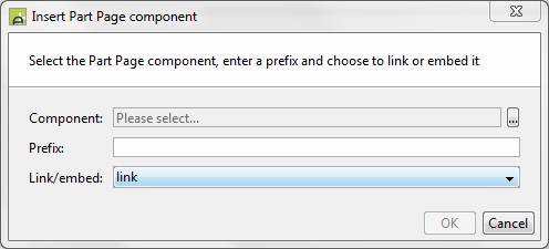
The
following dialog box is displayed (the title and component description vary
according to component type):

Component: click the …
button to display the workspace
browser containing a list of available components
Prefix: all form elements
inserted are prefixed with this name when the component is inserted into the
form - fields, tables, texts, controls, pages etc.
Link
/ embed: whether the inserted component instance should retain a link to
the original or whether it should just be copied into this form. Linked
components can be changed subsequently and then redeployed; embedded components
are copied at insert time, but then the link to the component is removed.
Testing components
Components can be tested in isolation
(just like running forms) by clicking the Test
![]() icon on the component toolbar. This causes the
component to be temporarily embedded into a dummy form and run in a browser to
allow the developer to test the component's behaviour before adding it to forms
or deploying any changes.
icon on the component toolbar. This causes the
component to be temporarily embedded into a dummy form and run in a browser to
allow the developer to test the component's behaviour before adding it to forms
or deploying any changes.
Deploying changes in components
Once a component has been linked into a
form, it may be modified in isolation and once the developer is happy with the
new component, the changes may be deployed to all forms linking to it by
clicking the Deploy changes icon ![]() on the main toolbar.
on the main toolbar.
Deleting components
Components may only be deleted if they are
not linked to any forms. You will be notified of any forms which are currently
linked to the component when you right click on the component in the hierarchy
tree panel and select delete. If you confirm deletion, all existing
fields for this component will be completely embedded into the form and all
links to the component will be lost.