Component Control
See also: Component Concepts, Controls, Layouts
Description
This control represents the root of a part-page component.
In the Component Editor when a part page component is edited, this control has a single property – Test Layout. As the name implies, this property sets the layout for the root component of the part-page component, but only in the design environment. When the component is deployed, this property is not used – instead the component will then use the layout of its parent control in the deployed page. Thus the Test Layout property shows how the component will appear if it is deployed into a container control with the same layout.
Once a part page component is deployed, the Component Control can be used as a handle for the component e.g. can be used to drag and drop the component to a new location or as a drop target for other controls.
Studio behaviour
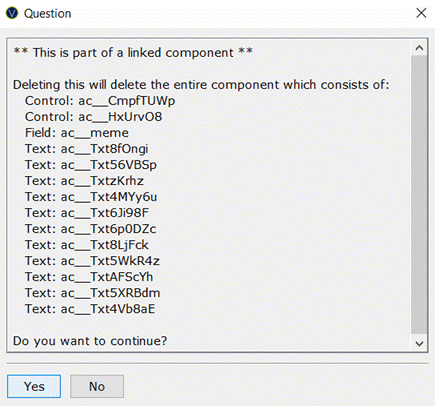
If this control is the root control of an embedded component, deletion and cutting function as normal. If this control is the root control of a linked component however, when this control or any of its children is deleted or cut, a confirmation dialog appears detailing all the linked elements, as shown below. Continuing will delete the component and all linked elements.

Properties
See also control common properties and local/inherited control properties.
Layout tab
|
Property |
Description |
Name1 |
Type1 |
Get1 |
Set1 |
|
Test Layout |
The test layout shown in the Component Editor. Note that this layout is not used once the component is deployed. See above for further details. |
|
|
No |
No |
1 See accessing control properties from scripts
Right Click Menu Actions
Click here for right-click menu actions available to all controls.
There are no specific right click actions for this control.
Appearance in Outline View
A Component Control is shown with the control name in brackets:
![]()
When a component is deployed, all items in the component are shown with a shaded grey background to distinguish them from non-component items.